Dotplots are very popular for visualizing single-cell RNAseq data. In essence, the dot size represents the percentage of cells that are positive for that gene; the color intensity represents the average gene expression of that gene in a cell type.
It is easy to plot one using Seurat::dotplot or Sccustomize::clustered_dotplot.
However, when you have multiple groups/conditions in your data and you want to
visualize it by groups, it is not that straightforward.
However, if you understand that the underlying data are just the percentages of positive cells and the average expression values and the dotplot is essentially just a heatmap, you can write R code to visualize the data in anyway you want.
Let’s use this data from https://satijalab.org/seurat/articles/integration_introduction
The object contains data from human PBMC from two conditions, interferon-stimulated and control cells (stored in the stim column in the object metadata). We will aim to integrate the two conditions together, so that we can jointly identify cell subpopulations across datasets, and then explore how each group differs across conditions
library(Seurat)
library(SeuratData)
library(patchwork)
library(harmony)
library(dplyr)
# install dataset
InstallData("ifnb")
# load dataset
ifnb <- LoadData("ifnb")
ifnb<- UpdateSeuratObject(ifnb)
ifnb#> An object of class Seurat
#> 14053 features across 13999 samples within 1 assay
#> Active assay: RNA (14053 features, 0 variable features)
#> 2 layers present: counts, dataTwo conditions: control and stimulated.
table(ifnb$stim)#>
#> CTRL STIM
#> 6548 7451routine processing
ifnb<- ifnb %>%
  NormalizeData(normalization.method = "LogNormalize", scale.factor = 10000) %>%
  FindVariableFeatures( selection.method = "vst", nfeatures = 2000) %>%
  ScaleData() %>%
  RunPCA() %>%
  RunHarmony(group.by.vars = "stim", dims.use = 1:30) %>%
  RunUMAP(reduction = "harmony", dims = 1:30) %>%
  FindNeighbors(reduction = "harmony", dims = 1:30) %>%
  FindClusters(resolution = 0.6)
#> Modularity Optimizer version 1.3.0 by Ludo Waltman and Nees Jan van Eck
#>
#> Number of nodes: 13999
#> Number of edges: 519190
#>
#> Running Louvain algorithm...
#> Maximum modularity in 10 random starts: 0.8855
#> Number of communities: 14
#> Elapsed time: 2 secondsLet’s take a look at the UMAP:
# Visualization
DimPlot(ifnb, reduction = "umap", group.by = c("stim", "seurat_annotations"))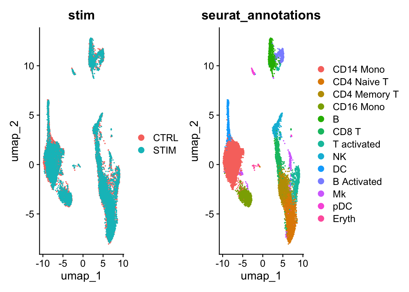
Let’s make a dotplot using Seurat
Idents(ifnb)<- ifnb$seurat_annotations
# NEEDS TO BE FIXED AND SET ORDER CORRECTLY
Idents(ifnb) <- factor(Idents(ifnb),
                       levels = c("pDC", "Eryth", "Mk", "DC",
                                                "CD14 Mono", "CD16 Mono","B Activated",
                                                "B", "CD8 T", "NK", "T activated",
                                                "CD4 Naive T", "CD4 Memory T"))

markers.to.plot <- c("CD3D", "CREM", "HSPH1", "SELL", "GIMAP5", "CACYBP", "GNLY",
                     "NKG7", "CCL5", "CD8A", "MS4A1", "CD79A", "MIR155HG", "NME1",
                     "FCGR3A", "VMO1", "CCL2", "S100A9", "HLA-DQA1", "GPR183",
                     "PPBP", "GNG11", "HBA2", "HBB", "TSPAN13", "IL3RA", "IGJ",
                     "PRSS57")

DotPlot(ifnb, features = markers.to.plot, cols = c("blue", "red"),
        dot.scale = 8, split.by = "stim") +
        RotatedAxis()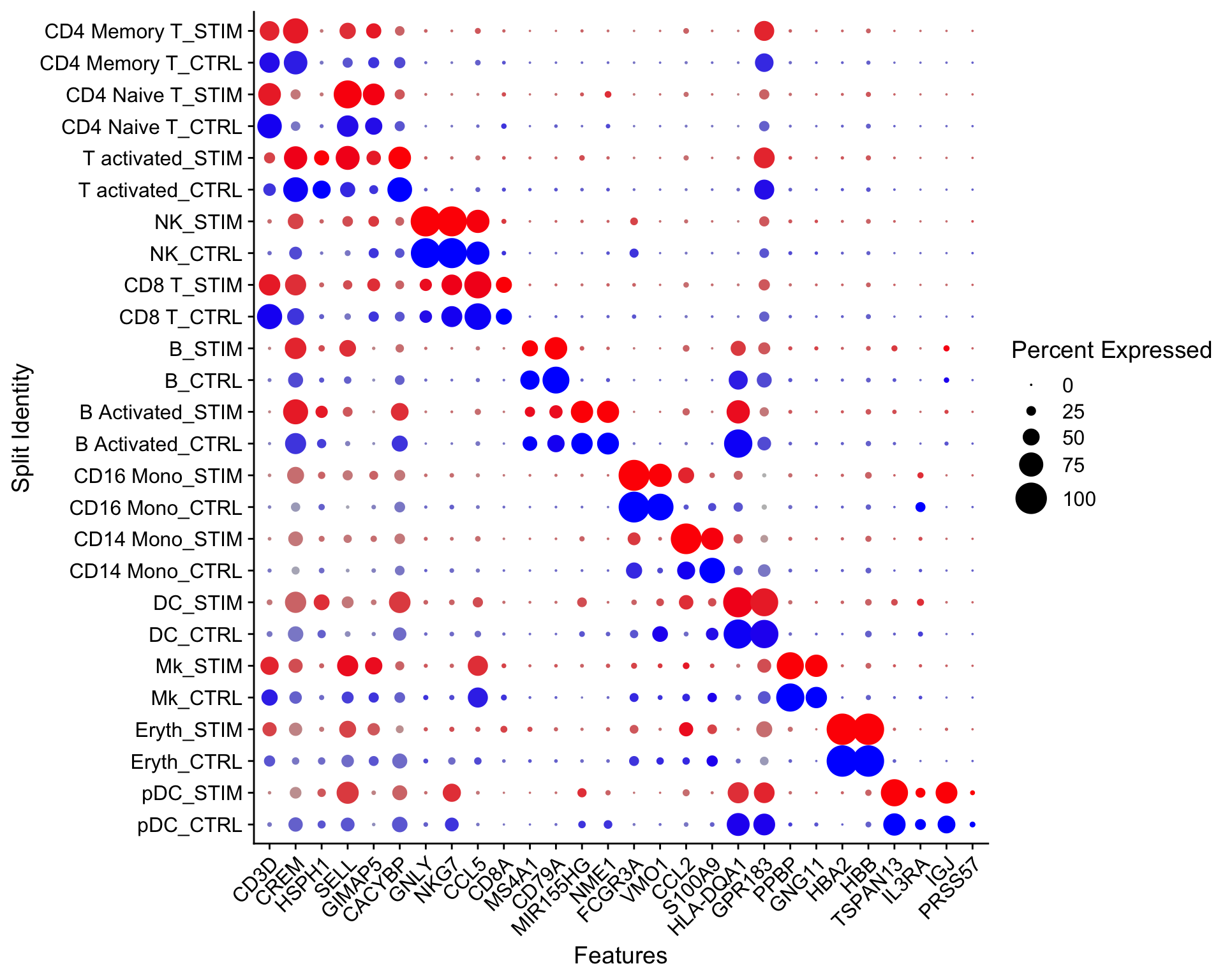
We can also use scCusstomize to cluster the dotplots, but you can not split by condition.
scCustomize::Clustered_DotPlot(ifnb, features = markers.to.plot,
                               plot_km_elbow = FALSE)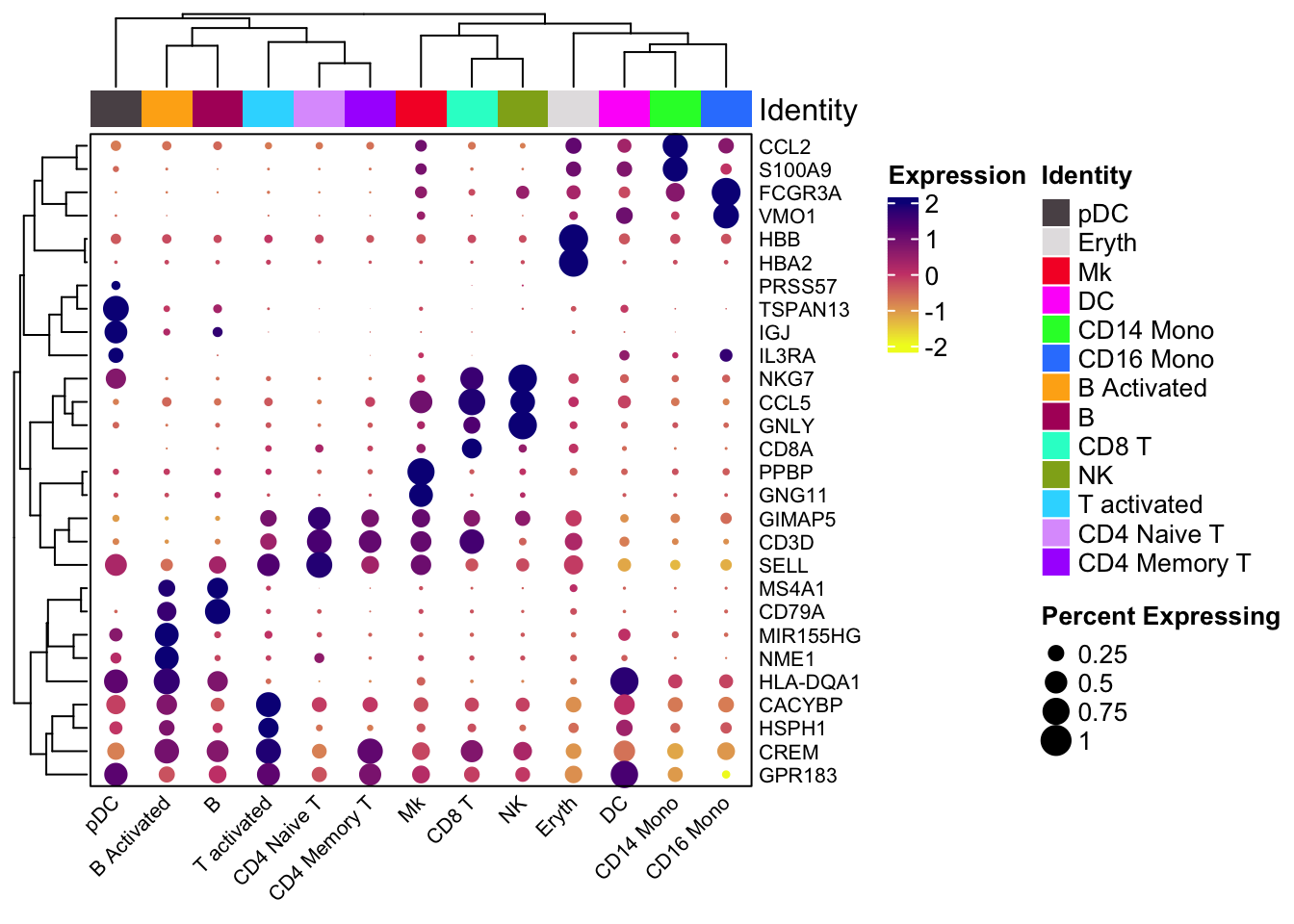
You can rotate the x and y axis:
scCustomize::Clustered_DotPlot(ifnb, features = markers.to.plot,
                               plot_km_elbow = FALSE, flip = TRUE)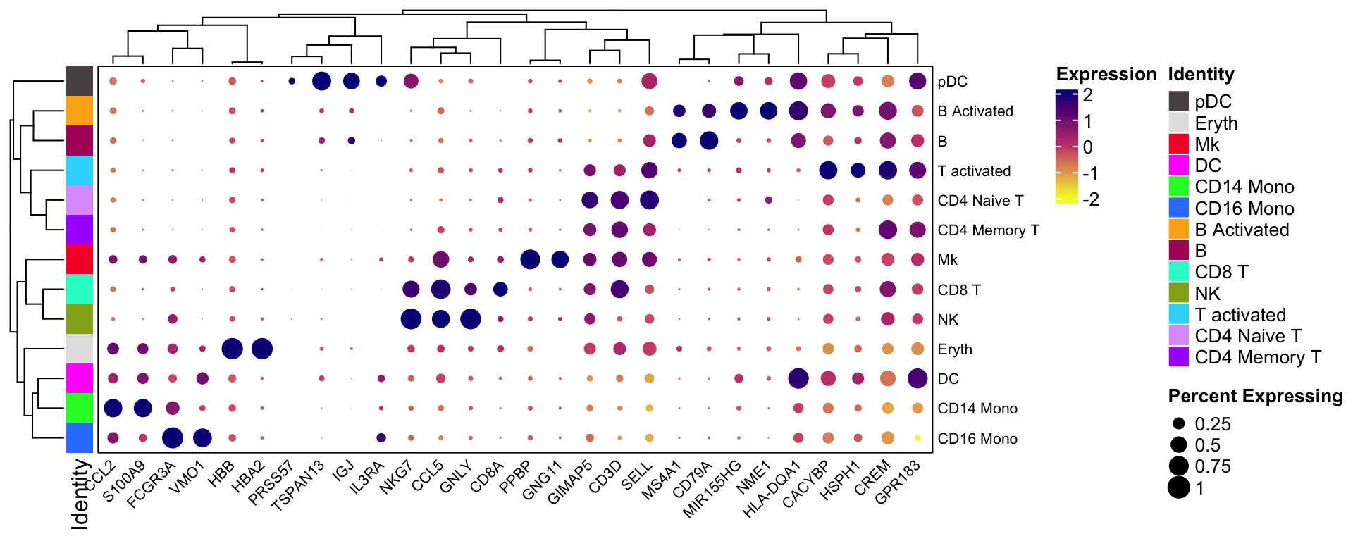
What if I want to split the dotplot by the condition?
Customized multi-group dotplot
We need to get the percentage of positive cells and average expression by group.
For a single gene, put the groups into multiple rows, and each column is a cell type.
# group1 is the cell type/cluster annotation
# group2 is any condition you want to further group, in this case, the stim

GetMatrixFromSeuratByGroupSingle<- function(obj, feature, group1, group2){
  if (length(feature) != 1){
          stop("please only provide only one gene name")
  }
  exp_mat<- obj@assays$RNA@data[feature, ,drop=FALSE]
  count_mat<- obj@assays$RNA@counts[feature,,drop=FALSE ]

  meta<- obj@meta.data %>%
  tibble::rownames_to_column(var = "cell")

  # get the average expression matrix
  exp_df<- as.matrix(exp_mat) %>%
    as.data.frame() %>%
    tibble::rownames_to_column(var="gene") %>%
    tidyr::pivot_longer(!gene, names_to = "cell", values_to = "expression") %>%
    left_join(meta) %>%
    group_by(gene,{{group1}}, {{group2}}) %>%
    summarise(average_expression = mean(expression)) %>%
    tidyr::pivot_wider(names_from = {{group1}},
                       values_from= average_expression)

  exp_mat<- exp_df[, -c(1,2)] %>% as.matrix()
  rownames(exp_mat)<- exp_df %>% pull({{group2}})

  # get the percentage positive cell matrix
  count_df<- as.matrix(count_mat) %>%
    as.data.frame() %>%
    tibble::rownames_to_column(var="gene") %>%
    tidyr::pivot_longer(!gene, names_to = "cell", values_to = "count") %>%
    left_join(meta) %>%
    group_by(gene, {{group1}}, {{group2}}) %>%
    summarise(percentage = mean(count >0)) %>%
    tidyr::pivot_wider(names_from = {{group1}},
                       values_from= percentage)

  percent_mat<- count_df[, -c(1,2)] %>% as.matrix()
  rownames(percent_mat)<- count_df %>% pull({{group2}})

  if (!identical(dim(exp_mat), dim(percent_mat))) {
    stop("the dimension of the two matrice should be the same!")
  }

  if(! all.equal(colnames(exp_mat), colnames(percent_mat))) {
    stop("column names of the two matrice should be the same!")
  }

  if(! all.equal(rownames(exp_mat), rownames(percent_mat))) {
    stop("column names of the two matrice should be the same!")
  }
  return(list(exp_mat = exp_mat, percent_mat = percent_mat))
}
Let’s get the matrices for one gene
mat<- GetMatrixFromSeuratByGroupSingle(obj= ifnb,
                                 feature = "ISG15",
                                 seurat_annotations,
                                 stim)

# take a look at the matrices
mat$exp_mat
#> CD14 Mono CD4 Naive T CD4 Memory T CD16 Mono B CD8 T
#> CTRL 0.7261719 0.3808203 0.4733928 1.117586 0.5495651 0.7284956
#> STIM 6.0702937 3.8087751 4.0137093 5.712665 4.3502870 4.0260494
#> T activated NK DC B Activated Mk pDC Eryth
#> CTRL 0.8074327 0.7889602 0.6561191 0.3800281 0.5941432 0.4085024 0.2929348
#> STIM 4.1129324 4.5385409 5.7027258 4.0121762 4.0114610 4.5247511 3.9331893mat$percent_mat#> CD14 Mono CD4 Naive T CD4 Memory T CD16 Mono B CD8 T
#> CTRL 0.323702 0.1666667 0.2072177 0.495069 0.2334152 0.3011364
#> STIM 1.000000 0.9927916 0.9900332 1.000000 0.9982487 0.9891775
#> T activated NK DC B Activated Mk pDC Eryth
#> CTRL 0.3233333 0.3154362 0.3527132 0.1891892 0.2608696 0.2156863 0.173913
#> STIM 0.9759760 0.9875389 1.0000000 1.0000000 0.9752066 1.0000000 1.000000Two matrices:
- the average expression for each cell type per condition
- the percentage of ISG15 positive cells for each cell type per condition
Now, Let’s visualize it using ComplexHeatmap. See my previous post too.
Always explore the data range before you decide how to map the data values to colors.
library(ComplexHeatmap)

quantile(mat$exp_mat, c(0.1, 0.5, 0.8, 0.9))
#> 10% 50% 80% 90%
#> 0.3946614 2.4631808 4.3502870 5.1206334col_fun<- circlize::colorRamp2(c(0, 2, 5), c("#FDE725FF", "#238A8DFF", "#440154FF"))0 will be mapped to #FDE725FF, 2 will be mapped to #238A8DFF and
5 will be mapped to #440154FF. The value in-between will be linearlly
interpolated to get corresponding colors
Use the layer_fun to decide the size of the dots. Within the grid.circle,
we specify the radius r= sqrt(pindex(mat$percent_mat, i, j)) of the circle to
be the square root of the percentage, so the area size of the dots correspond to
the percentage.
layer_fun = function(j, i, x, y, w, h, fill){
    grid.rect(x = x, y = y, width = w, height = h,
              gp = gpar(col = "gray", fill = NA))
    grid.circle(x=x,y=y,r= sqrt(pindex(mat$percent_mat, i, j)) * unit(4, "mm"),
                gp = gpar(fill = col_fun(pindex(mat$exp_mat, i, j)), col = NA))}

hp<- Heatmap(mat$exp_mat,
             heatmap_legend_param=list(title= "expression"),
             column_title = "ISG15",
             col=col_fun,
             rect_gp = gpar(type = "none"),
             layer_fun = layer_fun,
             row_names_gp = gpar(fontsize = 8),
             border = "black",
             cluster_rows = FALSE,
             cluster_columns = FALSE,
             row_names_side  = "left")
make the legend for the dot size. Make sure the size is the same as the in the
layer_fun which is unit(4, "mm"). You can change the size as you want.
lgd_list = list(
    Legend( labels = c(0, 10, 25, 50, 75), title = "percentage",
            graphics = list(
              function(x, y, w, h) grid.circle(x = x, y = y, r = 0  * unit(4, "mm"),
                                               gp = gpar(fill = "black")),
              function(x, y, w, h) grid.circle(x = x, y = y, r = sqrt(0.1)  * unit(4, "mm"),
                                               gp = gpar(fill = "black")),
              function(x, y, w, h) grid.circle(x = x, y = y, r = sqrt(0.25) * unit(4, "mm"),
                                               gp = gpar(fill = "black")),
              function(x, y, w, h) grid.circle(x = x, y = y, r = sqrt(0.5) * unit(4, "mm"),
                                               gp = gpar(fill = "black")),
              function(x, y, w, h) grid.circle(x = x, y = y, r = sqrt(0.75) * unit(4, "mm"),
                                               gp = gpar(fill = "black"))),
            row_gap = unit(2.5, "mm")
            ))

draw(hp, annotation_legend_list = lgd_list, ht_gap = unit(1, "cm"),
     annotation_legend_side = "right")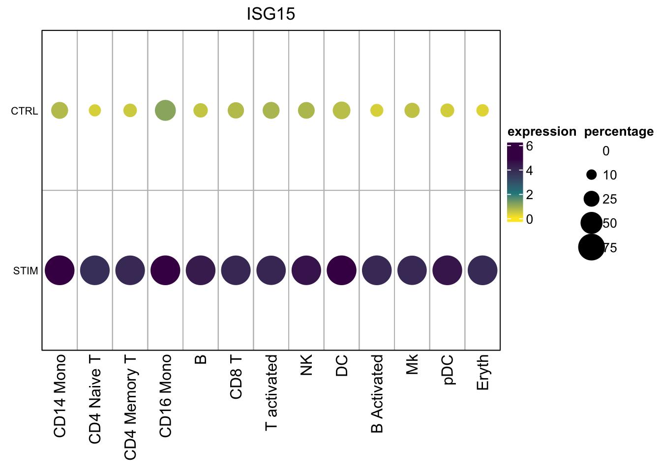
plot Multiple genes across multiple groups/conditions
Let’s change the function a little. The major difference is this line:
tidyr::pivot_wider(names_from = c({{group1}}, {{group2}}), values_from= average_expression, names_sep="|")
So the data will be wrangled as:
rows are genes, columns are cell_type|condition
GetMatrixFromSeuratByGroupMulti<- function(obj, features, group1, group2){
  exp_mat<- obj@assays$RNA@data[features, ,drop=FALSE]
  count_mat<- obj@assays$RNA@counts[features,,drop=FALSE ]

  meta<- obj@meta.data %>%
  tibble::rownames_to_column(var = "cell")

  # get the average expression matrix
  exp_df<- as.matrix(exp_mat) %>%
    as.data.frame() %>%
    tibble::rownames_to_column(var="gene") %>%
    tidyr::pivot_longer(!gene, names_to = "cell", values_to = "expression") %>%
    left_join(meta) %>%
    group_by(gene,{{group1}}, {{group2}}) %>%
    summarise(average_expression = mean(expression)) %>%
    # the trick is to make the data wider in columns: cell_type|group
    tidyr::pivot_wider(names_from = c({{group1}}, {{group2}}),
                       values_from= average_expression,
                       names_sep="|")

  # convert to a matrix
  exp_mat<- exp_df[, -1] %>% as.matrix()
  rownames(exp_mat)<- exp_df$gene

  # get percentage of positive cells matrix
  count_df<- as.matrix(count_mat) %>%
    as.data.frame() %>%
    tibble::rownames_to_column(var="gene") %>%
    tidyr::pivot_longer(!gene, names_to = "cell", values_to = "count") %>%
    left_join(meta) %>%
    group_by(gene, {{group1}}, {{group2}}) %>%
    summarise(percentage = mean(count >0)) %>%
    tidyr::pivot_wider(names_from = c({{group1}}, {{group2}}),
                       values_from= percentage,
                       names_sep="|")

  percent_mat<- count_df[, -1] %>% as.matrix()
  rownames(percent_mat)<- count_df$gene

  if (!identical(dim(exp_mat), dim(percent_mat))) {
    stop("the dimension of the two matrice should be the same!")
  }

  if(! all.equal(colnames(exp_mat), colnames(percent_mat))) {
    stop("column names of the two matrice should be the same!")
  }

  if(! all.equal(rownames(exp_mat), rownames(percent_mat))) {
    stop("column names of the two matrice should be the same!")
  }
  return(list(exp_mat = exp_mat, percent_mat = percent_mat))
}
Let’s take a look at the matrices:
mat2<- GetMatrixFromSeuratByGroupMulti(obj= ifnb,
                                       features = c("ISG15", "CXCL10", "LYZ", "CXCL9"),
                                       seurat_annotations, stim)

mat2$exp_mat
#> CD14 Mono|CTRL CD14 Mono|STIM CD4 Naive T|CTRL CD4 Naive T|STIM
#> CXCL10 0.087345121 5.0736492 0.002201396 0.61035184
#> CXCL9 0.003388209 0.1206664 0.000000000 0.00000000
#> ISG15 0.726171852 6.0702937 0.380820344 3.80877512
#> LYZ 2.414988107 2.6774910 0.041199264 0.04494943
#> CD4 Memory T|CTRL CD4 Memory T|STIM CD16 Mono|CTRL CD16 Mono|STIM
#> CXCL10 0.004476775 0.668992851 0.7766469 5.00934744
#> CXCL9 0.000000000 0.002439572 0.0000000 0.02062243
#> ISG15 0.473392848 4.013709315 1.1175865 5.71266540
#> LYZ 0.033556360 0.064249244 1.3894338 0.98728252
#> B|CTRL B|STIM CD8 T|CTRL CD8 T|STIM T activated|CTRL
#> CXCL10 0.02465307 2.40598430 0.00000000 0.509013005 0.00657299
#> CXCL9 0.00000000 0.01577367 0.00000000 0.004820181 0.00000000
#> ISG15 0.54956508 4.35028697 0.72849556 4.026049357 0.80743267
#> LYZ 0.04108924 0.04744420 0.03553156 0.041455107 0.04261386
#> T activated|STIM NK|CTRL NK|STIM DC|CTRL DC|STIM
#> CXCL10 1.16903785 0.00000000 0.4221097 0.028490195 4.7406904
#> CXCL9 0.00000000 0.00000000 0.0000000 0.006332865 0.4458563
#> ISG15 4.11293242 0.78896021 4.5385409 0.656119064 5.7027258
#> LYZ 0.01990898 0.01638341 0.0857032 3.773146881 3.2401631
#> B Activated|CTRL B Activated|STIM Mk|CTRL Mk|STIM pDC|CTRL
#> CXCL10 0.01261649 2.26825925 0.07612572 1.31048801 0.04369413
#> CXCL9 0.00000000 0.02436157 0.00000000 0.01622667 0.00000000
#> ISG15 0.38002811 4.01217616 0.59414320 4.01146096 0.40850237
#> LYZ 0.06561868 0.07417401 0.72371186 0.32235497 0.24321177
#> pDC|STIM Eryth|CTRL Eryth|STIM
#> CXCL10 2.25108405 0.0000000 1.6256344
#> CXCL9 0.06612518 0.0000000 0.0000000
#> ISG15 4.52475112 0.2929348 3.9331893
#> LYZ 0.02124968 0.6171084 0.3471586mat2$percent_mat#> CD14 Mono|CTRL CD14 Mono|STIM CD4 Naive T|CTRL CD4 Naive T|STIM
#> CXCL10 0.035214447 0.98369818 0.001022495 0.25557012
#> CXCL9 0.001805869 0.07033069 0.000000000 0.00000000
#> ISG15 0.323702032 1.00000000 0.166666667 0.99279161
#> LYZ 0.817155756 0.88868188 0.019427403 0.02162516
#> CD4 Memory T|CTRL CD4 Memory T|STIM CD16 Mono|CTRL CD16 Mono|STIM
#> CXCL10 0.002328289 0.27574751 0.2761341 0.98510242
#> CXCL9 0.000000000 0.00110742 0.0000000 0.01489758
#> ISG15 0.207217695 0.99003322 0.4950690 1.00000000
#> LYZ 0.016298021 0.02990033 0.6114398 0.47858473
#> B|CTRL B|STIM CD8 T|CTRL CD8 T|STIM T activated|CTRL
#> CXCL10 0.00982801 0.651488616 0.00000000 0.225108225 0.003333333
#> CXCL9 0.00000000 0.007005254 0.00000000 0.002164502 0.000000000
#> ISG15 0.23341523 0.998248687 0.30113636 0.989177489 0.323333333
#> LYZ 0.01965602 0.022767075 0.01704545 0.019480519 0.020000000
#> T activated|STIM NK|CTRL NK|STIM DC|CTRL DC|STIM
#> CXCL10 0.396396396 0.000000000 0.17445483 0.011627907 0.9766355
#> CXCL9 0.000000000 0.000000000 0.00000000 0.003875969 0.2570093
#> ISG15 0.975975976 0.315436242 0.98753894 0.352713178 1.0000000
#> LYZ 0.009009009 0.006711409 0.03738318 0.968992248 0.9626168
#> B Activated|CTRL B Activated|STIM Mk|CTRL Mk|STIM pDC|CTRL
#> CXCL10 0.005405405 0.60591133 0.02608696 0.371900826 0.01960784
#> CXCL9 0.000000000 0.01477833 0.00000000 0.008264463 0.00000000
#> ISG15 0.189189189 1.00000000 0.26086957 0.975206612 0.21568627
#> LYZ 0.037837838 0.03940887 0.26956522 0.123966942 0.11764706
#> pDC|STIM Eryth|CTRL Eryth|STIM
#> CXCL10 0.70370370 0.0000000 0.4375
#> CXCL9 0.03703704 0.0000000 0.0000
#> ISG15 1.00000000 0.1739130 1.0000
#> LYZ 0.01234568 0.2608696 0.1875Once you have the matrices, you can plot the dotplot as you want.
# change the layer function, because you need mat2$percent_mat for the percentages
layer_fun2 = function(j, i, x, y, w, h, fill){
    grid.rect(x = x, y = y, width = w, height = h,
              gp = gpar(col = "gray", fill = NA))
    grid.circle(x=x,y=y,
                r= sqrt(pindex(mat2$percent_mat, i, j)) * unit(4, "mm"),
                gp = gpar(fill = col_fun(pindex(mat2$exp_mat, i, j)), col = NA))}

hp2<- Heatmap(mat2$exp_mat,
             heatmap_legend_param=list(title= "expression"),
             column_title = "genes",
             col=col_fun,
             rect_gp = gpar(type = "none"),
             layer_fun = layer_fun2,
             row_names_gp = gpar(fontsize = 8),
             border = "black",
             cluster_rows = FALSE,
             cluster_columns = FALSE,
             row_names_side  = "left")


draw(hp2, annotation_legend_list = lgd_list, ht_gap = unit(1, "cm"),
     annotation_legend_side = "right")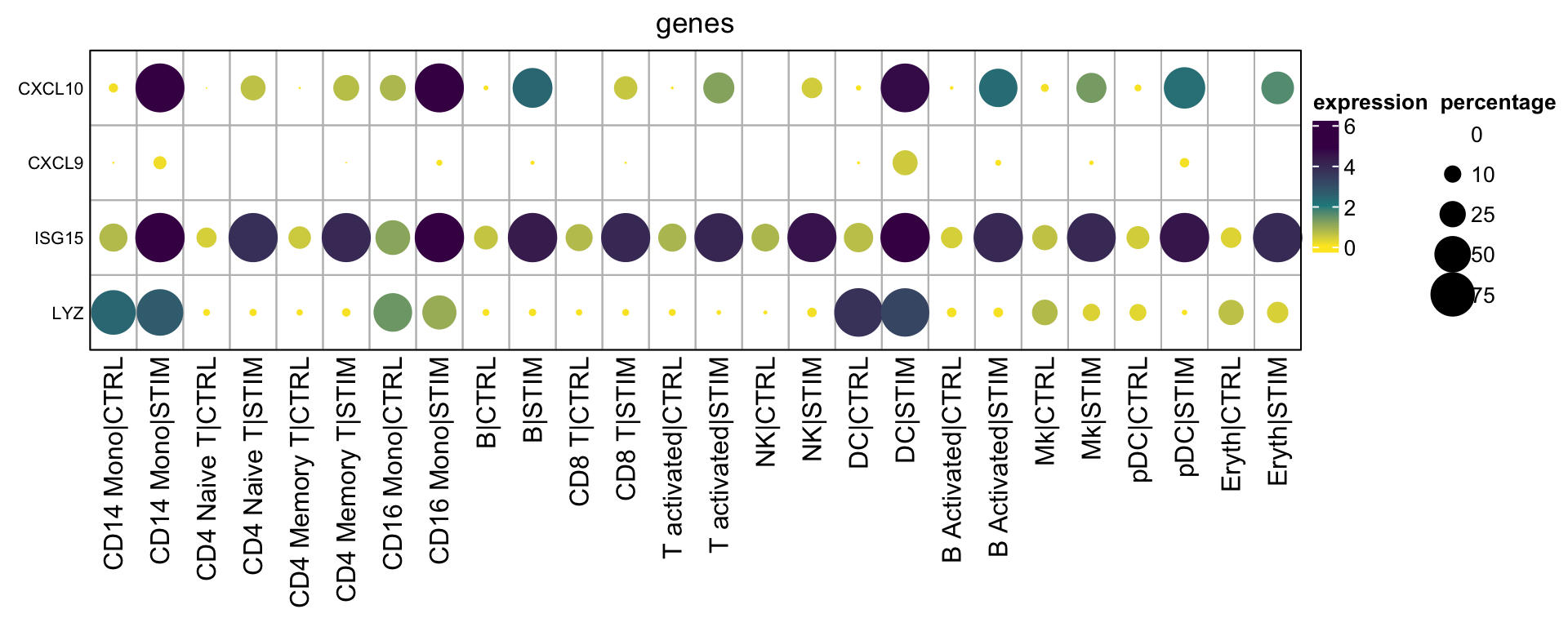
If you do want to cluster the columns and rows
hp3<- Heatmap(mat2$exp_mat,
             heatmap_legend_param=list(title= "expression"),
             column_title = "genes",
             col=col_fun,
             rect_gp = gpar(type = "none"),
             layer_fun = layer_fun2,
             row_names_gp = gpar(fontsize = 8),
             border = "black",
             cluster_rows = TRUE,
             cluster_columns = TRUE,
             row_names_side  = "left")


draw(hp3, annotation_legend_list = lgd_list, ht_gap = unit(1, "cm"),
     annotation_legend_side = "right")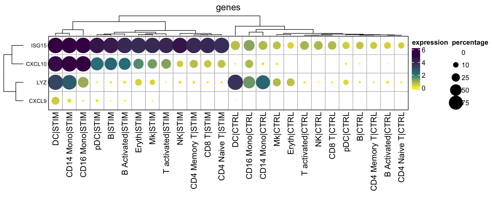
With the matrices available, you can do subsetting of the matrices, arrange the rows and columns as you want and even add annotation bars. As you see, once you master the basics, you can plot anything as you want without relying on pre-built packages.
We can wrap the above code into a function for easier usage, but I will leave it as a homework for the readers.
Of course, you do not want to re-invent the wheels, use a well-maintained package when possible, build your own wheel when necessary.
Further reading
plot1cell is trying
to solve the similar problem, but it is not that flexible.