introduce ggside using single cell data
The ggside R package provides a new way to visualize data by combining the flexibility of ggplot2 with the power of side-by-side plots.
We will use a single cell dataset to demonstrate its usage.
ggside allows users to create side-by-side plots of multiple variables, such as gene expression, cell type, and experimental conditions. This can be helpful for identifying patterns and trends in scRNA-seq data that would be difficult to see in individual plots. Additionally, ggside provides a number of features that make it easy to customize the appearance of side-by-side plots, such as changing the color scheme, adding labels, and adjusting the layout.
Load libraries
# install.packages("ggside")
library(ggside)
library(Seurat)
library(dplyr)
library(SeuratData)
load the 3k pbmc dataset.
data("pbmc3k")

pbmc3k
#> An object of class Seurat
#> 13714 features across 2700 samples within 1 assay
#> Active assay: RNA (13714 features, 0 variable features)2700 immune cells from blood.
routine processing
pbmc3k<- pbmc3k %>%
  NormalizeData(normalization.method = "LogNormalize", scale.factor = 10000) %>%
  FindVariableFeatures(selection.method = "vst", nfeatures = 2000) %>%
  ScaleData() %>%
  RunPCA(verbose = FALSE) %>%
  FindNeighbors(dims = 1:10, verbose = FALSE) %>%
  FindClusters(resolution = 0.5, verbose = FALSE) %>%
  RunUMAP(dims = 1:10, verbose = FALSE)

Idents(pbmc3k)<- pbmc3k$seurat_annotations

DimPlot(pbmc3k, label = TRUE, repel=TRUE) + NoLegend()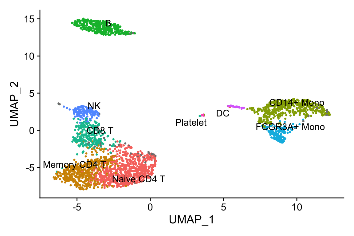
some helper functions to extract the gene expression values from the seurat object
matrix_to_expression_df<- function(x, obj){
        df<- x %>%
                as.matrix() %>%
                as.data.frame() %>%
                tibble::rownames_to_column(var= "gene") %>%
                tidyr::pivot_longer(cols = -1, names_to = "cell", values_to = "expression") %>%
                tidyr::pivot_wider(names_from = "gene", values_from = expression) %>%
                left_join(obj@meta.data %>%
                                  tibble::rownames_to_column(var = "cell"))
        return(df)
}


get_expression_data<- function(obj, assay = "RNA", slot = "data",
                               genes = NULL, cells = NULL){
        if (is.null(genes) & !is.null(cells)){
                df<- GetAssayData(obj, assay = assay, slot = slot)[, cells, drop = FALSE] %>%
                        matrix_to_expression_df(obj = obj)
        } else if (!is.null(genes) & is.null(cells)){
                df <- GetAssayData(obj, assay = assay, slot = slot)[genes, , drop = FALSE] %>%
                        matrix_to_expression_df(obj = obj)
        } else if (is.null(genes & is.null(cells))){
                df <- GetAssayData(obj, assay = assay, slot = slot)[, , drop = FALSE] %>%
                        matrix_to_expression_df(obj = obj)
        } else {
                df<- GetAssayData(obj, assay = assay, slot = slot)[genes, cells, drop = FALSE] %>%
                        matrix_to_expression_df(obj = obj)
        }
        return(df)
}
Test the function
df<- get_expression_data(obj = pbmc3k, genes = c("CD14", "FCGR3A"))

head(df)
#> # A tibble: 6 × 9
#> cell CD14 FCGR3A orig.ident nCount_RNA nFeature_RNA seurat_annotati…
#> <chr> <dbl> <dbl> <fct> <dbl> <int> <fct>
#> 1 AAACATACAACC… 0 0 pbmc3k 2419 779 Memory CD4 T
#> 2 AAACATTGAGCT… 0 0 pbmc3k 4903 1352 B
#> 3 AAACATTGATCA… 0 0 pbmc3k 3147 1129 Memory CD4 T
#> 4 AAACCGTGCTTC… 0 1.57 pbmc3k 2639 960 CD14+ Mono
#> 5 AAACCGTGTATG… 0 0 pbmc3k 980 521 NK
#> 6 AAACGCACTGGT… 0 0 pbmc3k 2163 781 Memory CD4 T
#> # … with 2 more variables: RNA_snn_res.0.5 <fct>, seurat_clusters <fct>Let’s only focus on the monocytes and use CD14 and CD16/FCGR3A as an example.
A plain scatter plot:
df %>%
filter(seurat_annotations %in% c("CD14+ Mono", "FCGR3A+ Mono")) %>%
ggplot(aes(x= CD14, y = FCGR3A)) +
geom_point(aes(color = seurat_annotations))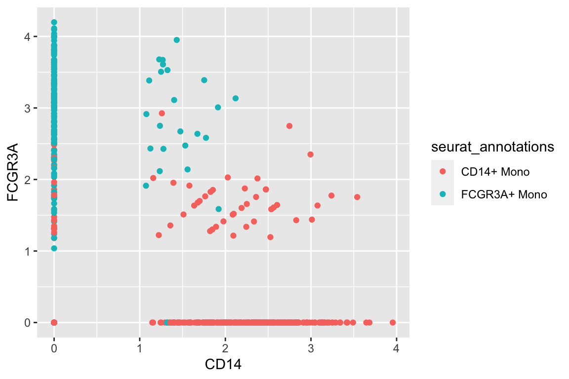 CD14+ monocytes are mostly CD14+CD16- and CD16+ monocytes are mostly CD16+CD14-
which makes sense.There are also some intermedidate cells that are CD14+CD16+ in the middle.
CD14+ monocytes are mostly CD14+CD16- and CD16+ monocytes are mostly CD16+CD14-
which makes sense.There are also some intermedidate cells that are CD14+CD16+ in the middle.
a scatter plot adding two boxplots:
df %>%
  filter(seurat_annotations %in% c("CD14+ Mono", "FCGR3A+ Mono")) %>%
  ggplot(aes(x= CD14, y = FCGR3A)) +
  geom_point(aes(color = seurat_annotations)) +
  geom_xsideboxplot(aes(y = seurat_annotations, color = seurat_annotations),
                    orientation = "y") +
  geom_ysideboxplot(aes(x = seurat_annotations, color = seurat_annotations),
                    orientation = "x")+
  scale_xsidey_discrete() +
  scale_ysidex_discrete()+
  theme(ggside.panel.scale.x = 0.2,
       ggside.panel.scale.y = 0.3)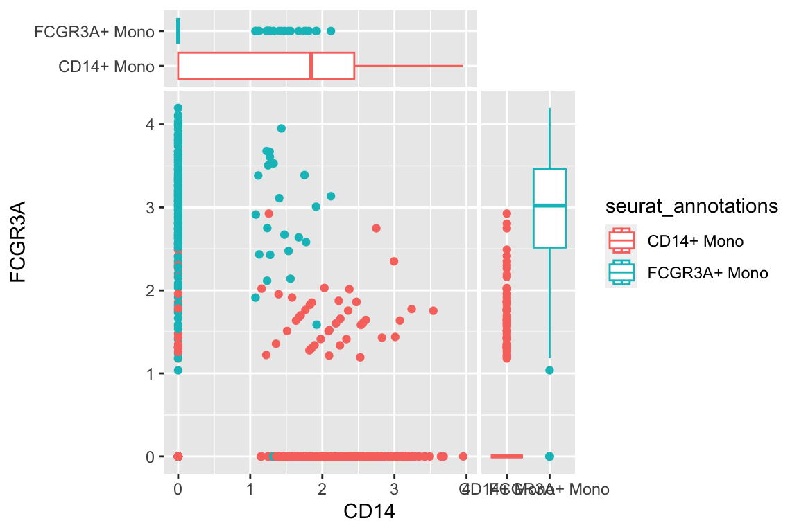
a scatterplot adding one boxplot and one density plot
df %>%
  filter(seurat_annotations %in% c("CD14+ Mono", "FCGR3A+ Mono")) %>%
  ggplot(aes(x= CD14, y = FCGR3A)) +
  geom_point(aes(color = seurat_annotations)) +
  geom_xsideboxplot(aes(y = seurat_annotations, color = seurat_annotations),
                    orientation = "y") +
  geom_ysidedensity(aes(x = after_stat(density), color = seurat_annotations, fill = seurat_annotations),
                    position = "stack", alpha = 0.4) +
  scale_xsidey_discrete() +
  scale_ysidex_continuous(guide = guide_axis(angle = 90), minor_breaks = NULL) +
  theme(ggside.panel.scale.x = 0.2,
       ggside.panel.scale.y = 0.4)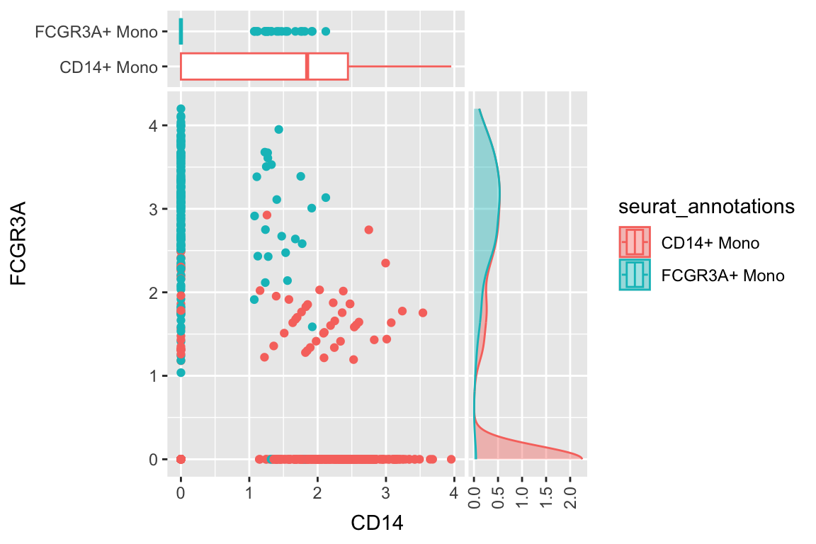
alternative way: use patchwork
https://patchwork.data-imaginist.com/
library(patchwork)

p1<- df %>%
  filter(seurat_annotations %in% c("CD14+ Mono", "FCGR3A+ Mono")) %>%
  ggplot(aes(x= seurat_annotations, y = CD14)) +
  geom_boxplot(aes(color = seurat_annotations)) +
  xlab("") +
  theme(
    axis.title.x = element_blank(),
    axis.text.x = element_blank(),
    axis.ticks.x = element_blank(),
    #legend.position = "none", legend.text = element_blank()
  )+
  coord_flip()

p2<- df %>%
  filter(seurat_annotations %in% c("CD14+ Mono", "FCGR3A+ Mono")) %>%
  ggplot(aes(x= CD14, y = FCGR3A)) +
  geom_point(aes(color = seurat_annotations)) +
  theme(legend.position = "none", legend.text = element_blank())

p3<- df %>%
  filter(seurat_annotations %in% c("CD14+ Mono", "FCGR3A+ Mono")) %>%
  ggplot(aes(x= seurat_annotations, y = FCGR3A)) +
  geom_boxplot(aes(color = seurat_annotations)) +
  theme(legend.position = "none") +
  ylab("") +
  xlab("") +
  theme(
    axis.title.y = element_blank(),
    axis.text.y = element_blank(),
    axis.ticks.y = element_blank()
  )

p1 + plot_spacer() + p2 + p3 +
   plot_layout(widths = c(4, 2), heights = c(1, 5),
               guides = 'collect')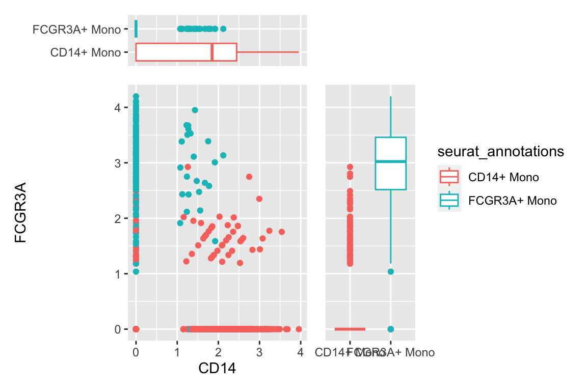
I hope you enjoyed this post! More later. Happy Learning!
I made a video for this in my chatomics youtube channel, check it out!