The problem
Let me be clear, when you have gazillions of data points in a scatter plot, you want to deal with the overplotting to avoid drawing misleading conclusions.
Let’s start with a single-cell example.
Load the libraries:
library(dplyr)
library(Seurat)
library(patchwork)
library(ggplot2)
library(ComplexHeatmap)
library(SeuratData)
set.seed(1234)
prepare the data
data("pbmc3k")

pbmc3k
#> An object of class Seurat
#> 13714 features across 2700 samples within 1 assay
#> Active assay: RNA (13714 features, 0 variable features)## routine processing
pbmc3k<- pbmc3k %>%
NormalizeData(normalization.method = "LogNormalize", scale.factor = 10000) %>%
FindVariableFeatures(selection.method = "vst", nfeatures = 2000) %>%
ScaleData() %>%
RunPCA(verbose = FALSE) %>%
FindNeighbors(dims = 1:10, verbose = FALSE) %>%
FindClusters(resolution = 0.5, verbose = FALSE) %>%
RunUMAP(dims = 1:10, verbose = FALSE)
Idents(pbmc3k)<- pbmc3k$seurat_annotations
pbmc3k<- pbmc3k[, !is.na(pbmc3k$seurat_annotations)]
DimPlot(pbmc3k, reduction = "umap", label = TRUE)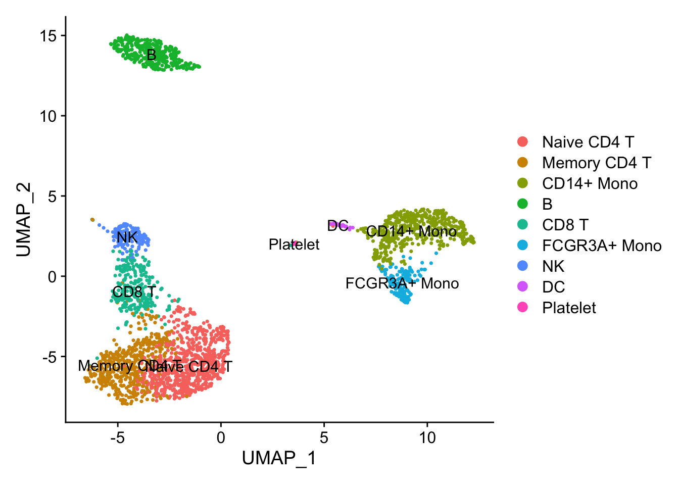
Illusion 1: dots are masked.
FeaturePlot(pbmc3k, features = c("CD4", "CD3D"))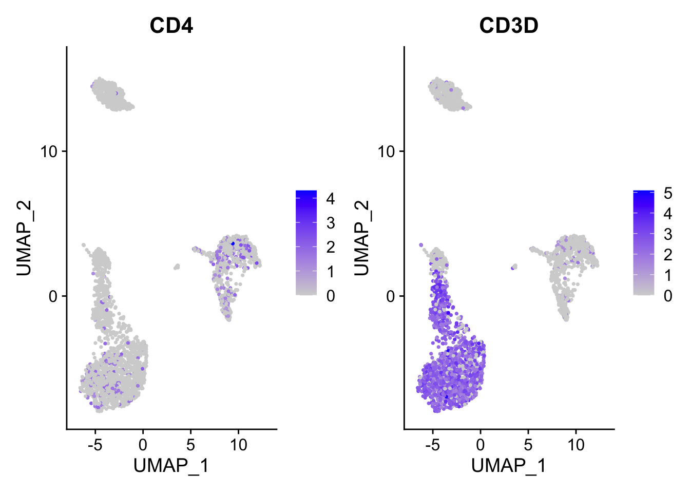
ggplot2 plots the dots with the order that they show in the dataframe. When you have
a lot of dots, they plot on top of each other. The blue dot can be masked by
the grey dot if the grey dot/cell appears after the blue dot/cell.
FeaturePlot(pbmc3k, features = c("CD4", "CD3D"), order = TRUE)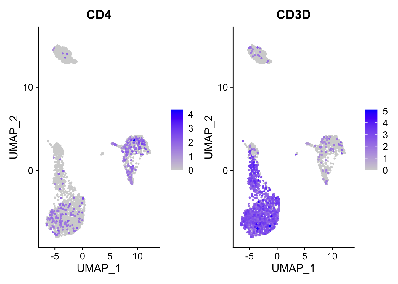
You can tell that it appears both CD4 and CD3D have enhanced expression after you set the order =TRUE.
Essentially, this will cause the cells with some expression of those genes plotted in the last.
Note, by default, scCustomize::FeaturePlot_scCustom set the order by TRUE. https://samuel-marsh.github.io/scCustomize/articles/Gene_Expression_Plotting.html#plot-gene-expression-in-2d-space-pcatsneumap
Illusion2: number of dots
Only when you plot the density of the points you know where are the dots are concentrated.
p1<- FeaturePlot(pbmc3k, features = "CD3D", order = TRUE)

p2<- scCustomize::Plot_Density_Custom(seurat_object = pbmc3k, features = "CD3D",
                                      viridis_palette= "viridis")

p1 | p2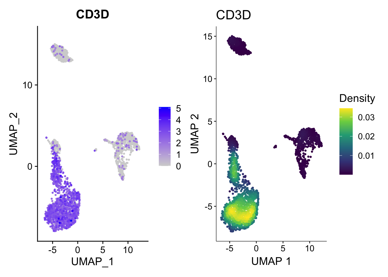
How the plot on the right was made?
No worries, let me show you how to plot the density plot from scratch using ggplot2.
First, some helper functions:
matrix_to_expression_df<- function(x, obj){
        df<- x %>%
                as.matrix() %>%
                as.data.frame() %>%
                tibble::rownames_to_column(var= "gene") %>%
                tidyr::pivot_longer(cols = -1, names_to = "cell", values_to = "expression") %>%
                tidyr::pivot_wider(names_from = "gene", values_from = expression) %>%
                left_join(obj@meta.data %>%
                                  tibble::rownames_to_column(var = "cell"))
        return(df)
}


get_expression_data<- function(obj, assay = "RNA", slot = "data",
                               genes = NULL, cells = NULL){
        if (is.null(genes) & !is.null(cells)){
                df<- GetAssayData(obj, assay = assay, slot = slot)[, cells, drop = FALSE] %>%
                        matrix_to_expression_df(obj = obj)
        } else if (!is.null(genes) & is.null(cells)){
                df <- GetAssayData(obj, assay = assay, slot = slot)[genes, , drop = FALSE] %>%
                        matrix_to_expression_df(obj = obj)
        } else if (is.null(genes & is.null(cells))){
                df <- GetAssayData(obj, assay = assay, slot = slot)[, , drop = FALSE] %>%
                        matrix_to_expression_df(obj = obj)
        } else {
                df<- GetAssayData(obj, assay = assay, slot = slot)[genes, cells, drop = FALSE] %>%
                        matrix_to_expression_df(obj = obj)
        }
        return(df)
}
library(ggpointdensity)
## fetch the dataframe
df<- get_expression_data(pbmc3k, genes = "CD3D")
umap_cor<- pbmc3k@reductions$umap@cell.embeddings %>%
as.data.frame() %>%
tibble::rownames_to_column(var = "cell")
df<- left_join(df, umap_cor)
head(df)#> # A tibble: 6 × 10
#> cell CD3D orig.ident nCount_RNA nFeature_RNA seurat_annotations
#> <chr> <dbl> <fct> <dbl> <int> <fct>
#> 1 AAACATACAACCAC 2.86 pbmc3k 2419 779 Memory CD4 T
#> 2 AAACATTGAGCTAC 0 pbmc3k 4903 1352 B
#> 3 AAACATTGATCAGC 3.49 pbmc3k 3147 1129 Memory CD4 T
#> 4 AAACCGTGCTTCCG 0 pbmc3k 2639 960 CD14+ Mono
#> 5 AAACCGTGTATGCG 0 pbmc3k 980 521 NK
#> 6 AAACGCACTGGTAC 1.73 pbmc3k 2163 781 Memory CD4 T
#> # … with 4 more variables: RNA_snn_res.0.5 <fct>, seurat_clusters <fct>,
#> # UMAP_1 <dbl>, UMAP_2 <dbl>p3<- ggplot(df, aes(x= UMAP_1, y= UMAP_2 )) +
geom_point(data = df %>% filter(CD3D == 0), color = "#440154FF", size = 0.6) +
ggpointdensity::geom_pointdensity(data = df %>% filter(CD3D > 0), size = 0.6) +
viridis::scale_color_viridis() +
theme_classic(base_size = 14) +
ggtitle("from scratch")
p2 | p3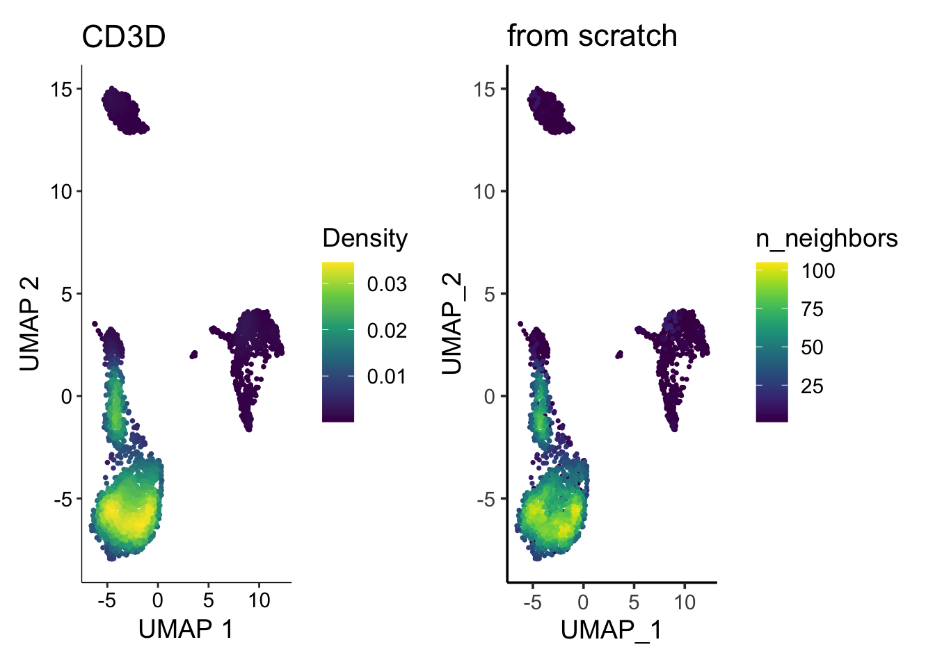
They look similar enough. Note the legend is different (density vs number of neighbors), but you get the idea.
Rastering
Have you found that when you have gazillions of points, the resulting PDF or PNG file is so big and your computer is so slow to view them?
Rastering the image come to the rescue. Let’s use https://github.com/exaexa/scattermore
library(scattermore)

ggplot(df, aes(x=UMAP_1, y= UMAP_2)) +
        geom_scattermore() +
        theme_classic(base_size = 14) +
        ggtitle("geom_scattermore")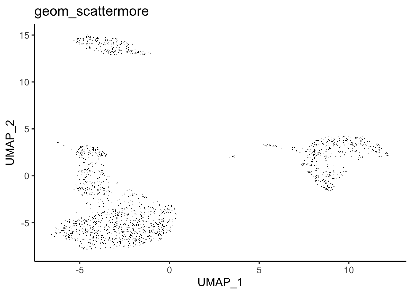
You can not see the difference here. But if you zoom in the figure on your computer, you will see the rectangles of the points.
For this small dataset (only 3000 cells), you can not feel the differences of plotting speed.
However, when you have millions of cells, you may want to give scattermore a try!
The same thing applies to heatmap too.
Please read: