Load libraries
library(dplyr)
library(Seurat)
library(patchwork)
library(ggplot2)
library(ComplexHeatmap)
library(SeuratData)
set.seed(1234)
prepare the data
data("pbmc3k")

pbmc3k
#> An object of class Seurat
#> 13714 features across 2700 samples within 1 assay
#> Active assay: RNA (13714 features, 0 variable features)## routine processing
pbmc3k<- pbmc3k %>%
NormalizeData(normalization.method = "LogNormalize", scale.factor = 10000) %>%
FindVariableFeatures(selection.method = "vst", nfeatures = 2000) %>%
ScaleData() %>%
RunPCA(verbose = FALSE) %>%
FindNeighbors(dims = 1:10, verbose = FALSE) %>%
FindClusters(resolution = 0.5, verbose = FALSE) %>%
RunUMAP(dims = 1:10, verbose = FALSE)
Idents(pbmc3k)<- pbmc3k$seurat_annotations
pbmc3k<- pbmc3k[, !is.na(pbmc3k$seurat_annotations)]
DimPlot(pbmc3k, reduction = "umap", label = TRUE)
some functions we will use
matrix_to_expression_df<- function(x, obj){
        df<- x %>%
                as.matrix() %>%
                as.data.frame() %>%
                tibble::rownames_to_column(var= "gene") %>%
                tidyr::pivot_longer(cols = -1, names_to = "cell", values_to = "expression") %>%
                tidyr::pivot_wider(names_from = "gene", values_from = expression) %>%
                left_join(obj@meta.data %>%
                                  tibble::rownames_to_column(var = "cell"))
        return(df)
}


get_expression_data<- function(obj, assay = "RNA", slot = "data",
                               genes = NULL, cells = NULL){
        if (is.null(genes) & !is.null(cells)){
                df<- GetAssayData(obj, assay = assay, slot = slot)[, cells, drop = FALSE] %>%
                        matrix_to_expression_df(obj = obj)
        } else if (!is.null(genes) & is.null(cells)){
                df <- GetAssayData(obj, assay = assay, slot = slot)[genes, , drop = FALSE] %>%
                        matrix_to_expression_df(obj = obj)
        } else if (is.null(genes & is.null(cells))){
                df <- GetAssayData(obj, assay = assay, slot = slot)[, , drop = FALSE] %>%
                        matrix_to_expression_df(obj = obj)
        } else {
                df<- GetAssayData(obj, assay = assay, slot = slot)[genes, cells, drop = FALSE] %>%
                        matrix_to_expression_df(obj = obj)
        }
        return(df)
}
check CD4 and CD3D correlation
genes<- c("CD3D", "CD4")

expression_data<- get_expression_data(pbmc3k, genes = genes)

head(expression_data)
#> # A tibble: 6 × 9
#> cell CD3D CD4 orig.ident nCount_RNA nFeature_RNA seurat_annotati…
#> <chr> <dbl> <dbl> <fct> <dbl> <int> <fct>
#> 1 AAACATACAACCAC 2.86 0 pbmc3k 2419 779 Memory CD4 T
#> 2 AAACATTGAGCTAC 0 0 pbmc3k 4903 1352 B
#> 3 AAACATTGATCAGC 3.49 0 pbmc3k 3147 1129 Memory CD4 T
#> 4 AAACCGTGCTTCCG 0 0 pbmc3k 2639 960 CD14+ Mono
#> 5 AAACCGTGTATGCG 0 0 pbmc3k 980 521 NK
#> 6 AAACGCACTGGTAC 1.73 0 pbmc3k 2163 781 Memory CD4 T
#> # … with 2 more variables: RNA_snn_res.0.5 <fct>, seurat_clusters <fct>Let’s make a scatter plot and check the correlation between CD3D and CD4
# https://github.com/LKremer/ggpointdensity
# ggpubr to add the correlation

ggplot(expression_data, aes(x= CD3D, y = CD4)) +
        #geom_smooth(method="lm") +
        geom_point(size = 0.8) +
        facet_wrap(~seurat_annotations) +
        ggpubr::stat_cor(method = "pearson")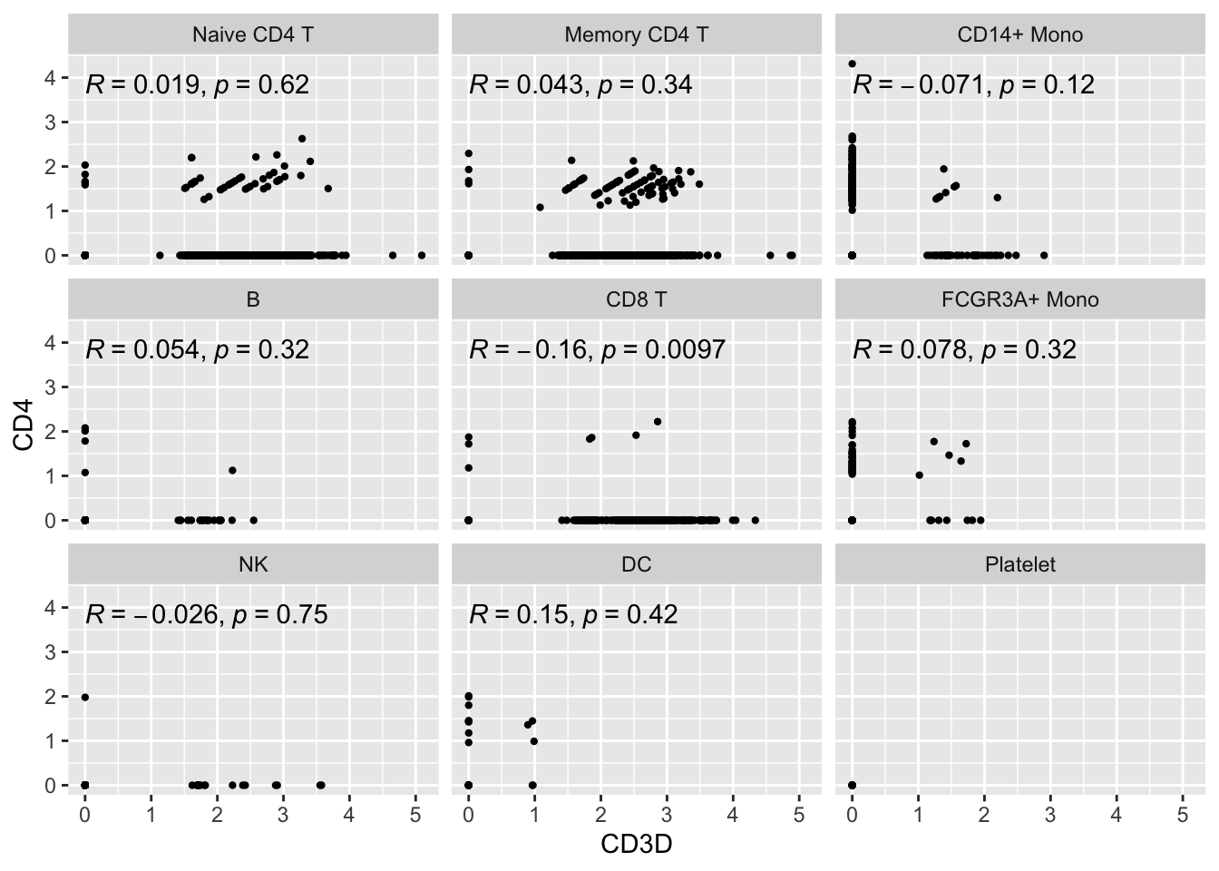
Let’s focus on the Naive CD4 T cells and Memory CD4 T cells.
Did you also notice the patches of dots on the diagonal lines? Also, there are many 0s in the x-axis and y-axis. This is very typical for single-cell RNAseq data. The data are very spare meaning there are many 0s in the count matrix.
Note, read my previous post on zero-inflation on scRNAseq data.
What’s going on with the cells on diagonal lines?
expression_data %>%
        filter(seurat_annotations == "Naive CD4 T", CD3D == CD4, CD3D !=0)
#> # A tibble: 9 × 9
#> cell CD3D CD4 orig.ident nCount_RNA nFeature_RNA seurat_annotati…
#> <chr> <dbl> <dbl> <fct> <dbl> <int> <fct>
#> 1 CCACCATGATCGGT 1.61 1.61 pbmc3k 2494 732 Naive CD4 T
#> 2 CGCTAAGACAACTG 1.53 1.53 pbmc3k 2771 858 Naive CD4 T
#> 3 CTTACAACTAACGC 1.65 1.65 pbmc3k 2368 854 Naive CD4 T
#> 4 GGGCAGCTTTTCTG 1.67 1.67 pbmc3k 2333 752 Naive CD4 T
#> 5 GTACCCTGTGAACC 1.61 1.61 pbmc3k 2510 787 Naive CD4 T
#> 6 GTCACCTGCCTCCA 1.74 1.74 pbmc3k 2126 742 Naive CD4 T
#> 7 TACTACTGTATGGC 1.51 1.51 pbmc3k 2843 843 Naive CD4 T
#> 8 TTACACACTCCTAT 1.61 1.61 pbmc3k 2507 815 Naive CD4 T
#> 9 TTCAACACAACAGA 1.63 1.63 pbmc3k 2429 847 Naive CD4 T
#> # … with 2 more variables: RNA_snn_res.0.5 <fct>, seurat_clusters <fct>There are 9 cells on the y=x diagonal line.
Let’s take a look at their raw counts
cells<- expression_data %>%
        filter(seurat_annotations == "Naive CD4 T", CD3D == CD4, CD3D !=0) %>%
        pull(cell)

pbmc3k@assays$RNA@counts[genes, cells]
#> 2 x 9 sparse Matrix of class "dgCMatrix"
#> CCACCATGATCGGT CGCTAAGACAACTG CTTACAACTAACGC GGGCAGCTTTTCTG GTACCCTGTGAACC
#> CD3D 1 1 1 1 1
#> CD4 1 1 1 1 1
#> GTCACCTGCCTCCA TACTACTGTATGGC TTACACACTCCTAT TTCAACACAACAGA
#> CD3D 1 1 1 1
#> CD4 1 1 1 1They all have counts of 1! the log normalization by library size make them on the y=x line.
Let’s highlight them:
ggplot(expression_data %>%
               mutate(highlight = if_else(cell%in% cells, "yes", "no")) %>%
               filter(seurat_annotations == "Naive CD4 T"),
       aes(x= CD3D, y = CD4)) +
        geom_point(aes(col = highlight), size = 0.8) +
        scale_color_manual(values = c("black", "red"))+
        facet_wrap(~seurat_annotations) +
        ggpubr::stat_cor(method = "pearson")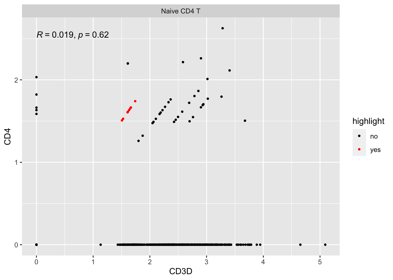
Let’s look at some other cells on the diagonal line with slop not equal to 1:
cells2<- expression_data %>%
        filter(seurat_annotations == "Naive CD4 T", CD3D !=0, CD4 !=0, CD3D != CD4) %>%
        pull(cell)

pbmc3k@assays$RNA@counts[genes, cells2]
#> 2 x 33 sparse Matrix of class "dgCMatrix"
#>
#> CD3D 3 2 2 11 4 3 3 4 2 2 4 3 2 4 2 3 2 2 1 1 2 2 2 3 4 3 2 4 3 4 5 3 4
#> CD4 1 1 1 1 1 1 1 1 1 1 2 1 1 1 1 1 1 1 2 2 1 1 1 1 1 2 1 1 1 1 1 1 1extract cells with CD4 counts of 1 and CD3D counts of 3:
other_cells<- pbmc3k@assays$RNA@counts[genes, cells2, drop = FALSE] %>%
        as.matrix() %>%
        as.data.frame() %>%
        tibble::rownames_to_column(var= "gene") %>%
        tidyr::pivot_longer(cols = -1, names_to = "cell", values_to = "expression") %>%
        tidyr::pivot_wider(names_from = "gene", values_from = expression) %>%
        filter(CD3D == 3, CD4 == 1) %>%
        pull(cell)
Let’s see where are they:
ggplot(expression_data %>%
               mutate(highlight = if_else(cell%in% other_cells, "yes", "no")) %>%
               filter(seurat_annotations == "Naive CD4 T"),
       aes(x= CD3D, y = CD4)) +
        geom_point(aes(col = highlight), size = 0.8) +
        scale_color_manual(values = c("black", "red"))+
        facet_wrap(~seurat_annotations) +
        ggpubr::stat_cor(method = "pearson")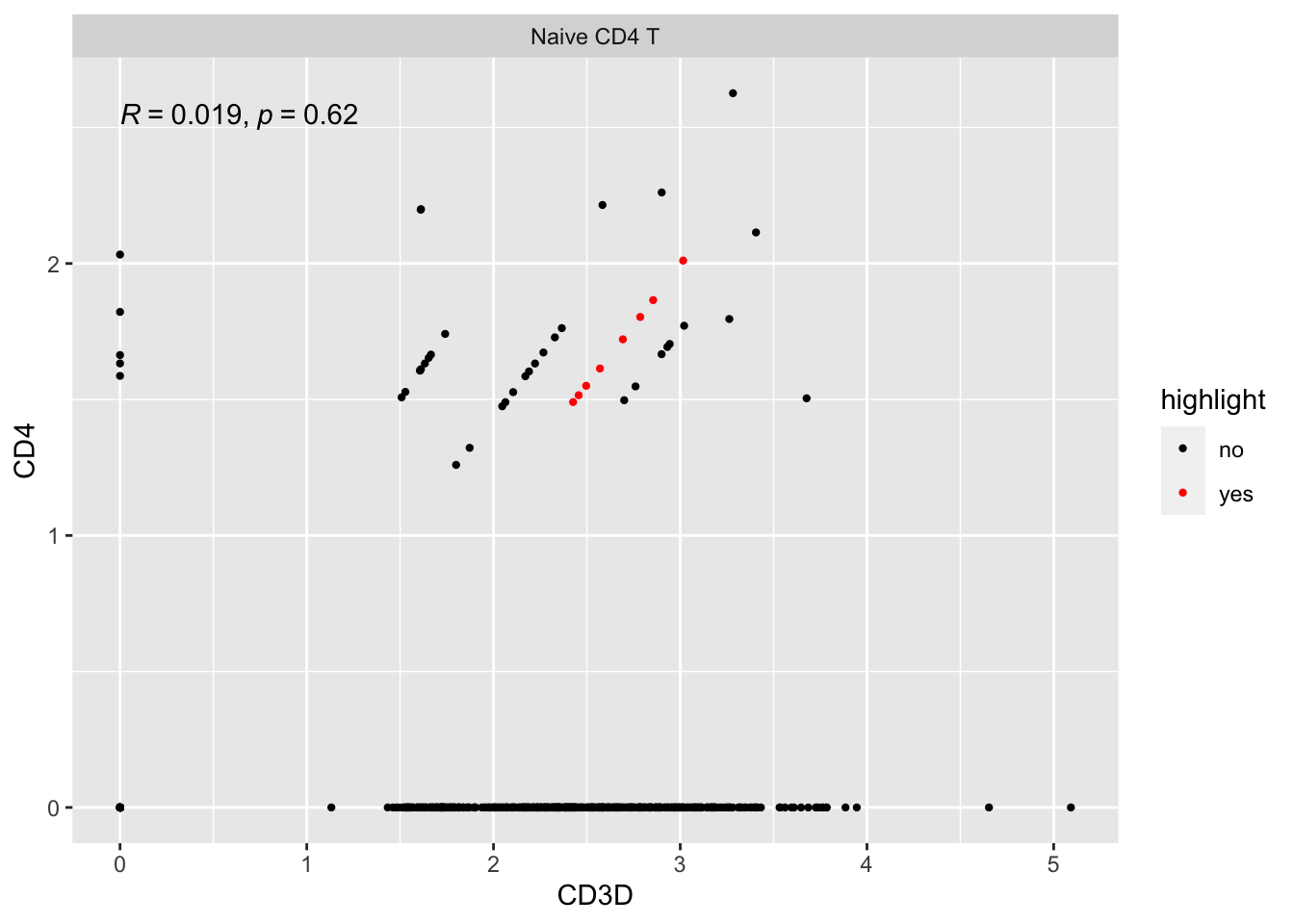
So, all those stripes of dots are of the same discrete counts for each gene, respectively. They are on the same line just because the library size (sequencing depth) for each cell is different.
It has to do with the discrete distribution of the counts.
CD4_naive_cells<- WhichCells(pbmc3k, expression = seurat_annotations == "Naive CD4 T")

get_expression_data(pbmc3k, slot = "count", cells= CD4_naive_cells) %>%
        ggplot(aes(x = CD4)) +
        geom_histogram(binwidth = 1) +
        coord_cartesian(xlim = c(0,5))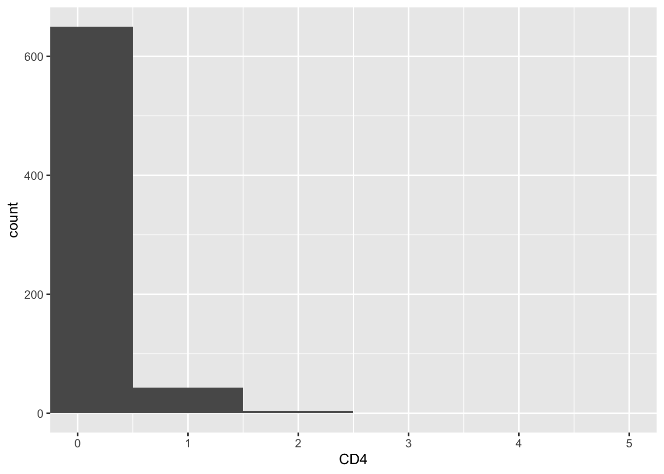
One way to get around the 0s is to do imputation using tools such as SAVER.
Read A systematic evaluation of single-cell RNA-sequencing imputation methods.
We found that the majority of scRNA-seq imputation methods outperformed no imputation in recovering gene expression observed in bulk RNA-seq. However, the majority of the methods did not improve performance in downstream analyses compared to no imputation, in particular for clustering and trajectory analysis, and thus should be used with caution. In addition, we found substantial variability in the performance of the methods within each evaluation aspect. Overall, MAGIC, kNN-smoothing, and SAVER were found to outperform the other methods most consistently
Be careful that you may have false-positives.
Let’s try DINO
DINO is more of a normalization methods rather than an imputation tool. We use it because it was developed by our team member Matthew Bernstein’s old colleague. Matt did a journal club for us.
Dino utilizes a flexible mixture of Negative Binomials model of gene expression to reconstruct full gene-specific expression distributions which are independent of sequencing depth. By giving exact zeros positive probability, the Negative Binomial components are applicable to shallow sequencing (high proportions of zeros)
#BiocManager::install("Dino")
library(Dino)

pbmc3k_norm<- Dino(pbmc3k@assays$RNA@counts, nCores = 4)
#> Some genes have expression non-zero expression below 'minNZ' when subsampled
#> and will be normalized via scale-factorpbmc3k_dino<- SeuratFromDino(pbmc3k_norm, doNorm = FALSE, doLog = TRUE)
# no need to run the normalization again.
pbmc3k_dino<- pbmc3k_dino %>%
FindVariableFeatures(selection.method = "vst", nfeatures = 2000) %>%
ScaleData() %>%
RunPCA(verbose = FALSE) %>%
FindNeighbors(dims = 1:10, verbose = FALSE) %>%
FindClusters(resolution = 0.5, verbose = FALSE) %>%
RunUMAP(dims = 1:10, verbose = FALSE)
## borrow the cell annotation
cell_annotations<- pbmc3k@meta.data %>%
tibble::rownames_to_column(var = "cell") %>%
select(cell, seurat_annotations)
new_meta<- pbmc3k_dino@meta.data %>%
tibble::rownames_to_column(var = "cell") %>%
left_join(cell_annotations)
new_meta<- as.data.frame(new_meta)
rownames(new_meta)<- new_meta$cell
pbmc3k_dino@meta.data<- new_meta %>% select(-cell)
Idents(pbmc3k_dino)<- pbmc3k_dino$seurat_annotations
pbmc3k_dino<- pbmc3k_dino[, !is.na(pbmc3k_dino$seurat_annotations)]
DimPlot(pbmc3k_dino, reduction = "umap", label = TRUE)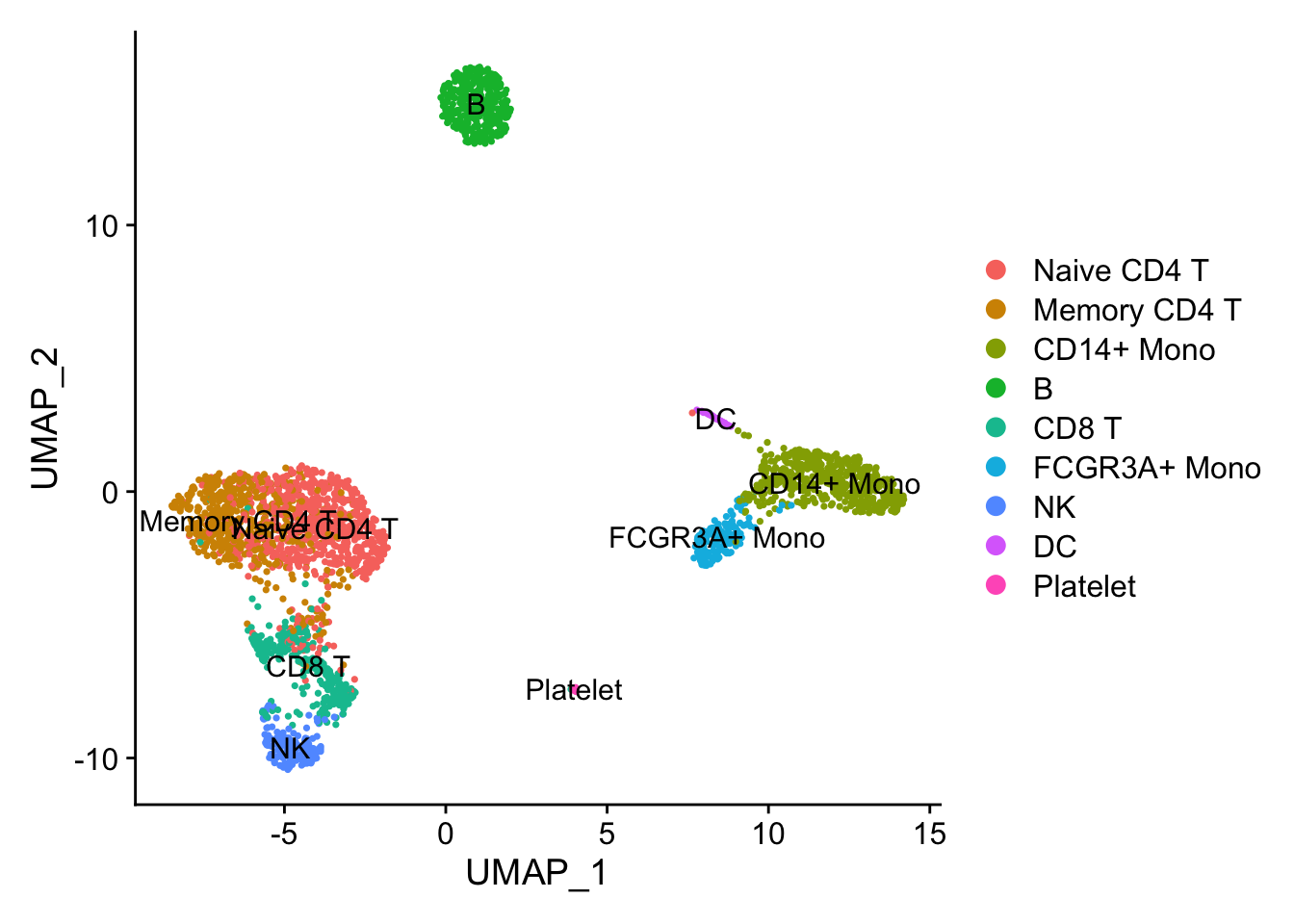
visualization
expression_data2<- get_expression_data(pbmc3k_dino, genes = genes)

head(expression_data2)
#> # A tibble: 6 × 7
#> cell CD3D CD4 orig.ident RNA_snn_res.0.5 seurat_clusters
#> <chr> <dbl> <dbl> <fct> <fct> <fct>
#> 1 AAACATACAACCAC 1.51 0 SeuratProject 2 2
#> 2 AAACATTGAGCTAC 0 0.00797 SeuratProject 3 3
#> 3 AAACATTGATCAGC 2.11 0 SeuratProject 0 0
#> 4 AAACCGTGCTTCCG 0.105 0.0788 SeuratProject 1 1
#> 5 AAACCGTGTATGCG 0.473 0.0305 SeuratProject 6 6
#> 6 AAACGCACTGGTAC 0.781 0.00598 SeuratProject 0 0
#> # … with 1 more variable: seurat_annotations <fct>ggplot(expression_data2, aes(x= CD3D, y = CD4)) +
#geom_smooth(method="lm") +
geom_point(size = 0.8) +
facet_wrap(~seurat_annotations) +
ggpubr::stat_cor(method = "pearson")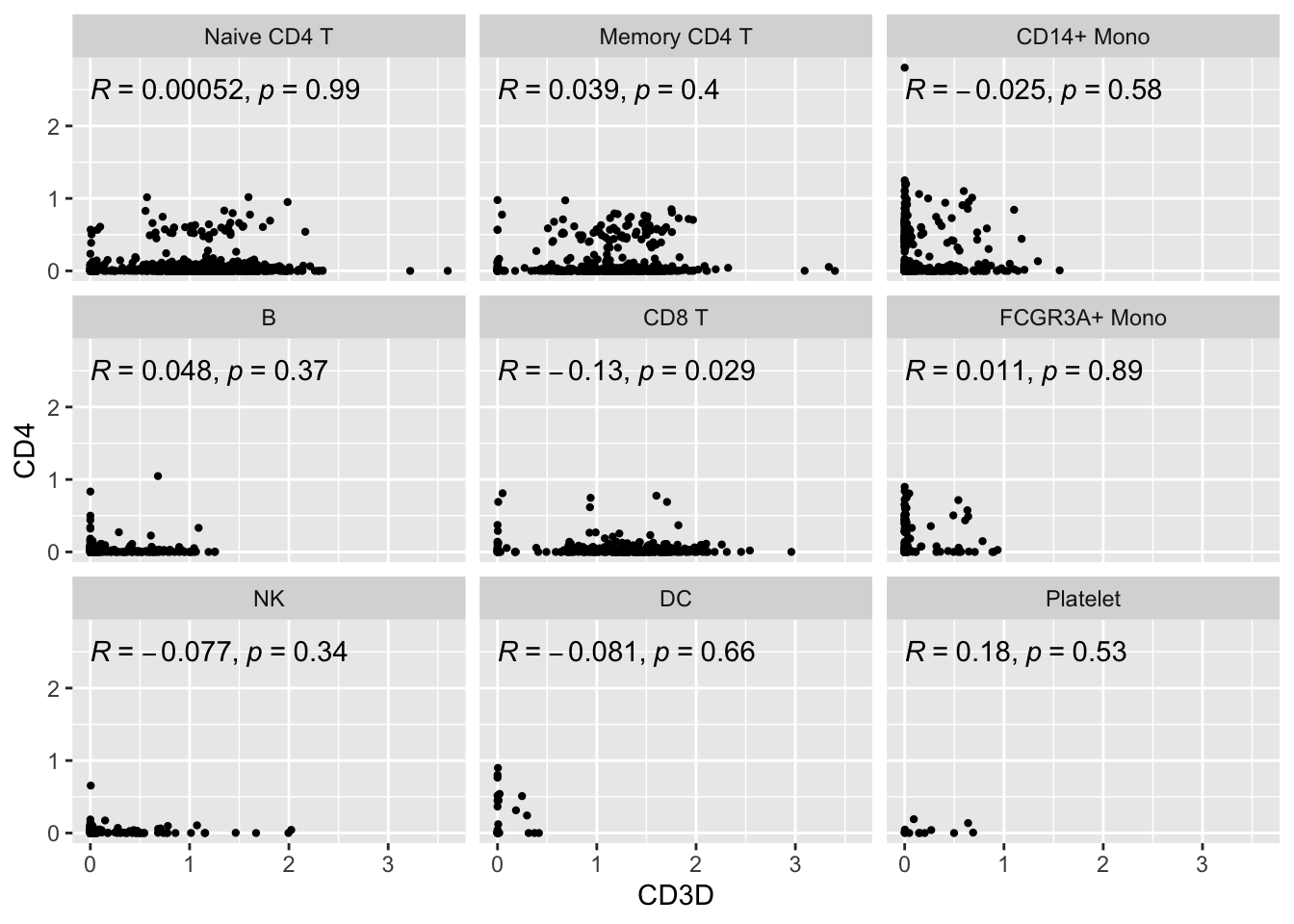
It did not help much for CD4’s expression. Many of the cells still have 0 or very low expression of CD4 in CD4 T cells. The strips of dots pattern does disappear.
It is known that CD4 mRNA and protein levels are not always correlated. read this twitter thread https://twitter.com/tangming2005/status/1501766040686108678. Similarly, CD56/NCAM (NK cell marker) mRNA is not expressed highly in NK cells.
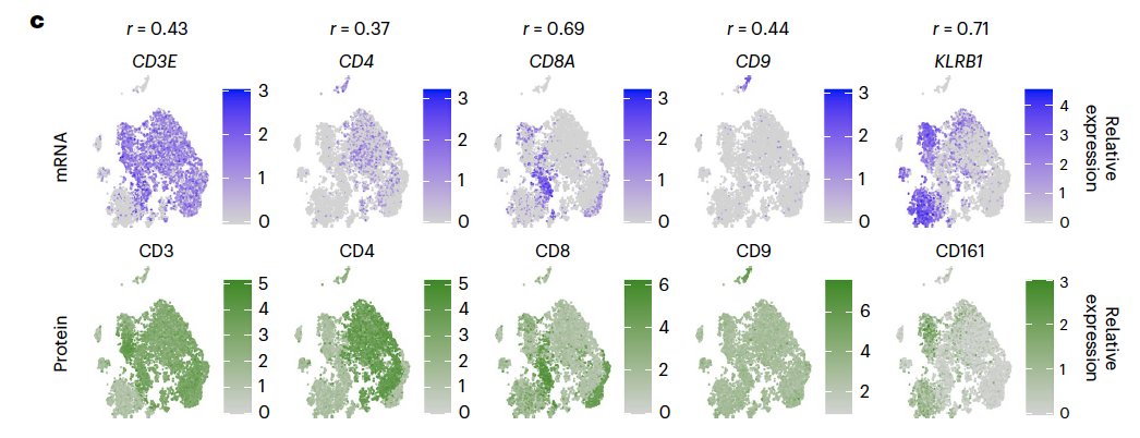
It is the same with CITE-seq data:
All the CITE-seq data I have worked with have the same phenomena. Low CD4 RNA and moderate CD4 ADT signal.
Note that CITE-seq has its noise too.
Since a major component of ADT noise in CITE-seq data is due to ambient capture of unbound ADTs nearly ALL of the cells in this experiment are ‘positive’ for CD4 protein.
read this blog post https://rpubs.com/MattPM/cd4 and the paper for more details.
In another study Quantification of extracellular proteins, protein complexes and mRNAs in single cells by proximity sequencing:
It shows poor correlation of mRNA and protein for some well-known marker genes:
 In the coming post, let’s see if
 DINO helps for other correlated genes.
Until next post, take care of others, take care of yourself!
Further reading
Evaluating measures of association for single-cell transcriptomics
Bulk RNA-seq has many 0s too! read Transcriptomics for Clinical and Experimental Biology Research: Hang on a Seq.
Why I love sharing
Because I get to know more from the replies.
There is the "zero inflated" Kendall tau and Spearman correlation metrics as described in https://t.co/Guh26SWGET and implemented with sample-specific weights in the scHOT package https://t.co/BcsHVl5tKk see the weightedZIKendall() and weightedZISpearman() functions
— Shila Ghazanfar (@shazanfar) January 18, 2023
Let me try the the “zero inflated” Kendall tau and Spearman described in Association of zero-inflated continuous variables.
Implemented in weightedZIKendall() and weightedZISpearman() in the scHOT package
#BiocManager::install("scHOT")
library(scHOT)
CD3D<- expression_data %>%
        filter(seurat_annotations == "Naive CD4 T") %>%
        pull(CD3D)

CD4<- expression_data %>%
        filter(seurat_annotations == "Naive CD4 T") %>%
        pull(CD4)

scHOT::weightedZIKendall(CD3D, CD4)
#> [1] 0.009568571scHOT::weightedSpearman(CD3D, CD4)#> [1] -0.004406211The coefficient is very small. I will try it with other highly correlated genes in my next post.