If you ask me: what’s your favorite machine learning algorithm? I would answer logistic regression (with regularization: Lasso, Ridge and Elastic) followed by random forest. In fact, that’s how we try those methods in order. Deep learning can perform well for tabular data with complicated architecture while random forest or boost tree based method usually work well out of the box. Regression and random forest are more interpretable too.
Youtube video for this post:
Read: Why do tree-based models still outperform deep learning on tabular data?
We all know we can use random forest to do classification or regression (supervised machine learning), but do you know you can use random forest for clustering too (unsupervised machine learning)?
When you have a mixed numeric and categorical dataset where it’s not straightforward to define a distance between observations, random forest can be trained in an unsupervised manner and generate the proximity matrix.
The proximity represents the percentage of trees where the two observations appear in the same leaf node. So the higher the value, the closer the observations.
This is pretty cool! I first got to know it from Josh Starmer’s StatQuest!
For datasets that are all numeric, the Random Forest step is not necessary. You can use distance/similarity metrics such as Euclidean, Mahalanobis, and Manhattan (?dist in R).
Use random forest for classification
Let’s use a real example with the iris dataset.
library(tidymodels)
set.seed(123)
data<- iris
head(data)
#> Sepal.Length Sepal.Width Petal.Length Petal.Width Species
#> 1 5.1 3.5 1.4 0.2 setosa
#> 2 4.9 3.0 1.4 0.2 setosa
#> 3 4.7 3.2 1.3 0.2 setosa
#> 4 4.6 3.1 1.5 0.2 setosa
#> 5 5.0 3.6 1.4 0.2 setosa
#> 6 5.4 3.9 1.7 0.4 setosatable(data$Species)#>
#> setosa versicolor virginica
#> 50 50 50It is a small dataset with 3 species of flowers: setosa, versicolor, virginica. The feaures are the sepal/petal length/width.
split the dataset to training and testing sets.
data_split <- initial_split(data, strata = "Species")
data_train <- training(data_split)
data_test <- testing(data_split)
build a random forest model using tidymodels to classify the species:
rf_recipe <-
  recipe(formula = Species ~ ., data = data_train) %>%
  step_zv(all_predictors())

## feature importance sore to TRUE, and the proximity matrix to TRUE
rf_spec <- rand_forest() %>%
  set_engine("randomForest", importance = TRUE, proximity = TRUE) %>%
  set_mode("classification")

rf_workflow <- workflow() %>%
  add_recipe(rf_recipe) %>%
  add_model(rf_spec)


rf_fit <- fit(rf_workflow, data = data_train)
We can use the model to do classification on the testing set:
## confusion matrix
predict(rf_fit, new_data = data_test) %>%
        bind_cols(data_test %>% select(Species)) %>%
        conf_mat(truth = Species, estimate = .pred_class)
#> Truth
#> Prediction setosa versicolor virginica
#> setosa 13 0 0
#> versicolor 0 13 1
#> virginica 0 0 12Read my previous blog post on using random forest for scRNAseq marker gene identification.
Use the proximity matrix for clustering
The proximity matrix is hidden deep in the list:
proximity_mat<- rf_fit$fit$fit$fit$proximity

pca_prcomp<- prcomp(proximity_mat, center = TRUE, scale. = FALSE)
plot(pca_prcomp)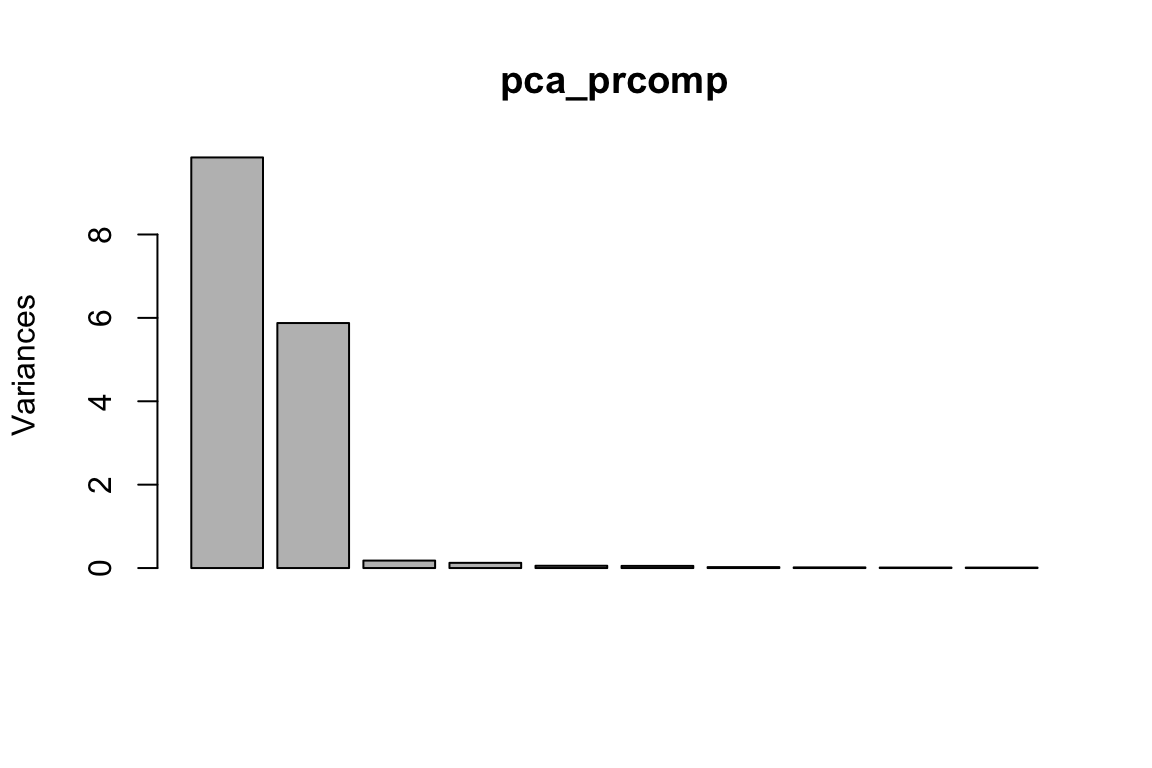
pca_df<- data.frame(pca_prcomp$x[,1:2], Species = data_train$Species)

ggplot(pca_df, aes(x= PC1, y = PC2)) +
        geom_point(aes(color = Species))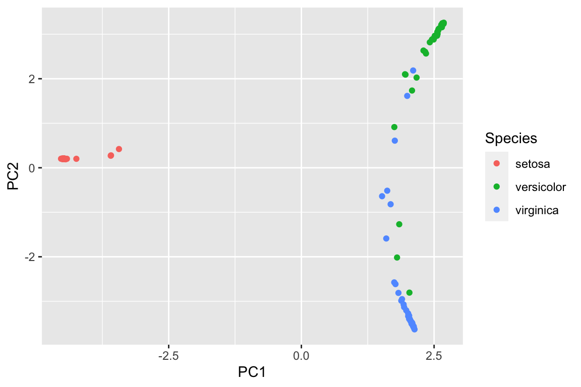
of course, we can use the original matrix for PCA too because they are all numeric values for the variables.
head(data_train)#> Sepal.Length Sepal.Width Petal.Length Petal.Width Species
#> 3 4.7 3.2 1.3 0.2 setosa
#> 4 4.6 3.1 1.5 0.2 setosa
#> 5 5.0 3.6 1.4 0.2 setosa
#> 7 4.6 3.4 1.4 0.3 setosa
#> 8 5.0 3.4 1.5 0.2 setosa
#> 9 4.4 2.9 1.4 0.2 setosapca_prcomp2<- prcomp(as.matrix(data_train[, -5]), center = TRUE, scale. = FALSE)
plot(pca_prcomp2)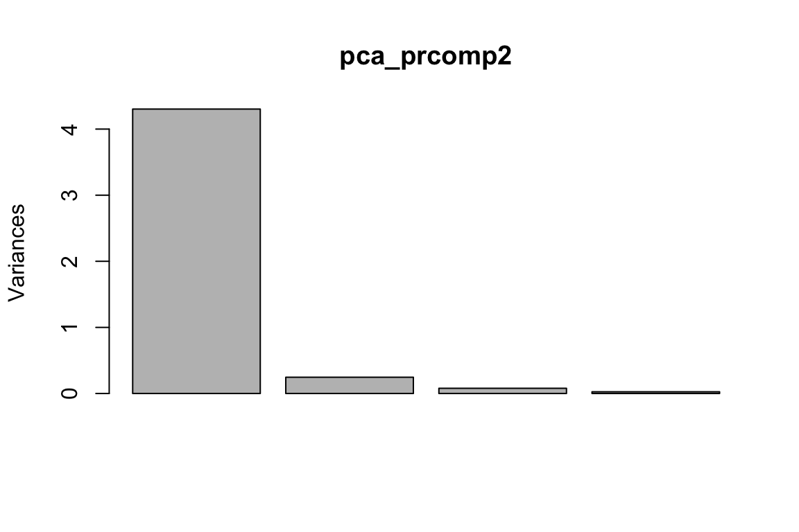
pca_df2<- data.frame(pca_prcomp2$x[,1:2], Species = data_train$Species)

ggplot(pca_df2, aes(x= PC1, y = PC2)) +
        geom_point(aes(color = Species))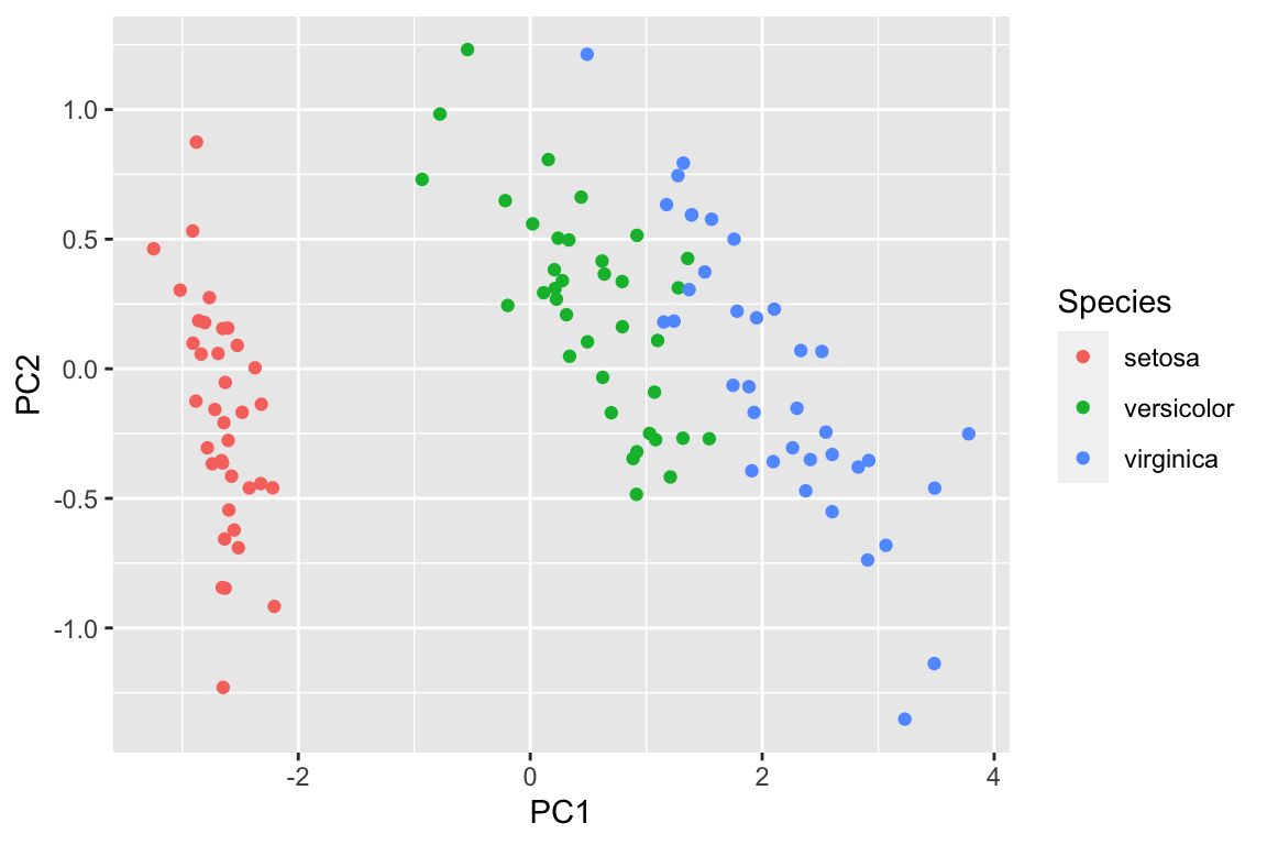
However, imagine that not all the variables are numeric, and we can not easily plot a PCA plot using the raw data. We can use random forest to get a proximity matrix and use that matrix for PCA as shown above.
clustering using the proximity matrix
dim(proximity_mat)#> [1] 111 111proximity_mat[1:5, 1:5]#> 1 2 3 4 5
#> 1 1.0000000 0.9857143 1.00000 1.0000000 1.000000
#> 2 0.9857143 1.0000000 0.96875 0.9848485 0.974026
#> 3 1.0000000 0.9687500 1.00000 1.0000000 1.000000
#> 4 1.0000000 0.9848485 1.00000 1.0000000 1.000000
#> 5 1.0000000 0.9740260 1.00000 1.0000000 1.000000rownames(proximity_mat)<- data_train[, 5]
colnames(proximity_mat)<- data_train[, 5]
# turn it to a distance
iris_distance<- dist(1-proximity_mat)
# hierarchical clustering
hc<- hclust(iris_distance)
# cut the tree to 3 clusters
clusters<- cutree(hc, k = 3)library(dendextend)
library(dendsort)
library(Polychrome)
mypal <- kelly.colors(4)[-1]
swatch(mypal)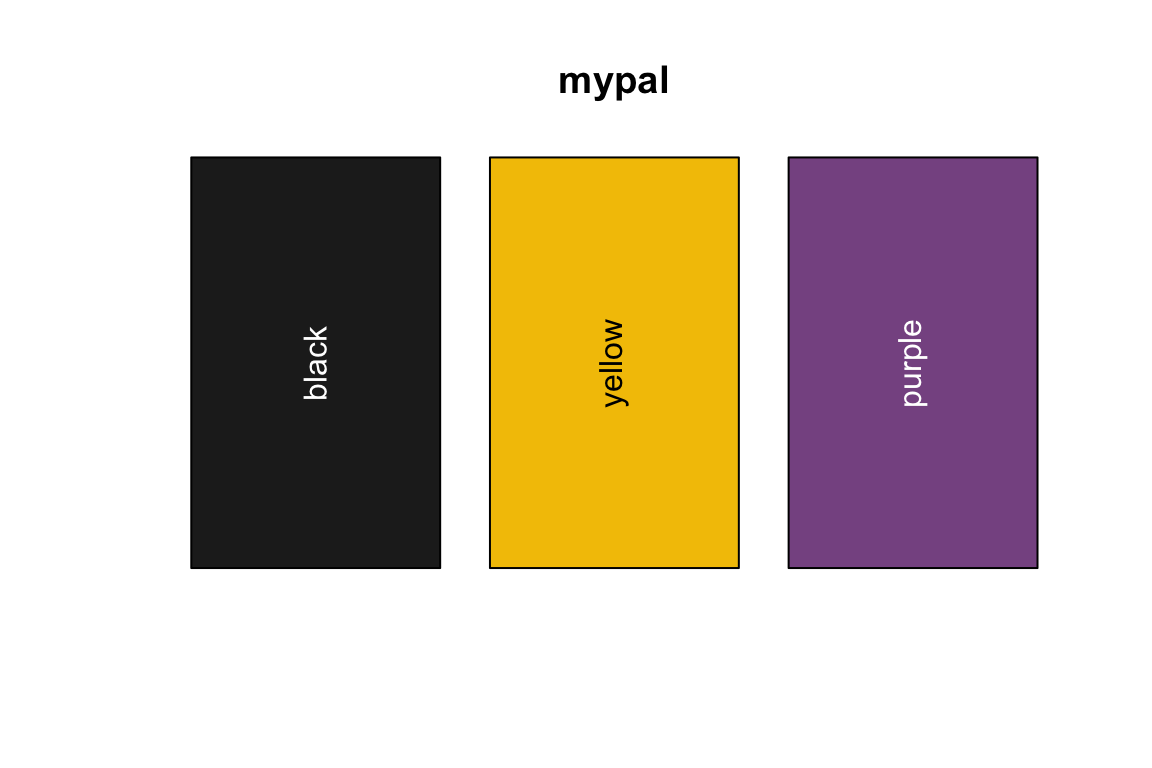
plot_dend<- function(dend,...){
  dend_labels<- dend %>% labels()

  dend %>%
  color_labels(col = mypal[as.numeric(as.factor(dend_labels))]) %>%
  set("labels_cex", 0.7) %>%
  plot(...)
}
plot the dendrogram
# no sorting on dendrogram
as.dendrogram(hc) %>%
        plot_dend()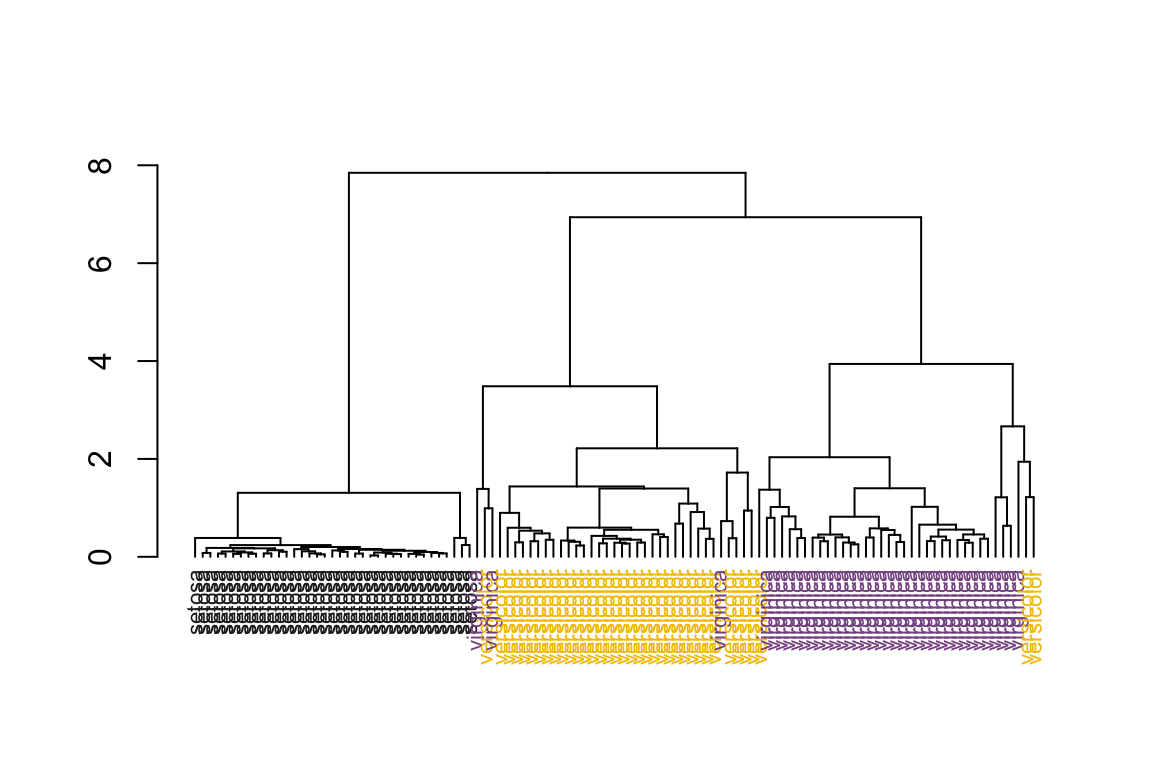
# sort the dendrogram
as.dendrogram(hc) %>%
        dendsort() %>%
        plot_dend()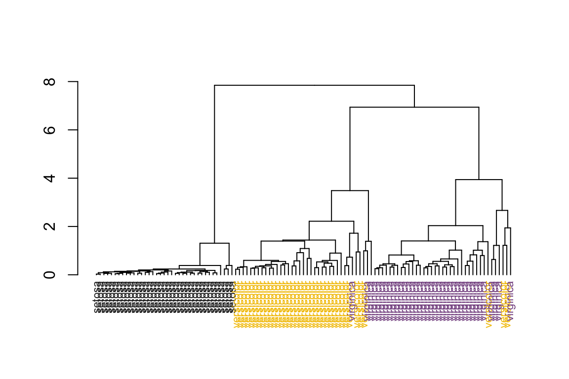
visualize the clusters in the PCA plot using the proximity matrix. We see there are some miss-classifications between versicolor and virginica.
pca_df<- data.frame(pca_prcomp$x[,1:2],
                    Species = data_train$Species,
                    clusters = as.factor(clusters))

ggplot(pca_df, aes(x= PC1, y = PC2)) +
        geom_point(aes(color = Species, shape = clusters)) +
        theme_bw(base_size = 14)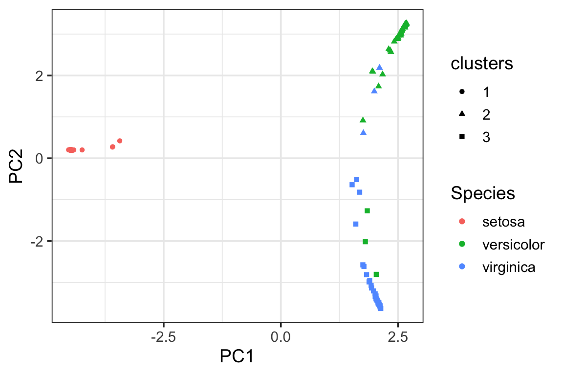
visualize the clusters in the PCA plot using the raw data.
pca_df2<- data.frame(pca_prcomp2$x[,1:2],
                    Species = data_train$Species,
                    clusters = as.factor(clusters))

ggplot(pca_df2, aes(x= PC1, y = PC2)) +
        geom_point(aes(color = Species, shape = clusters)) +
        theme_bw(base_size = 14)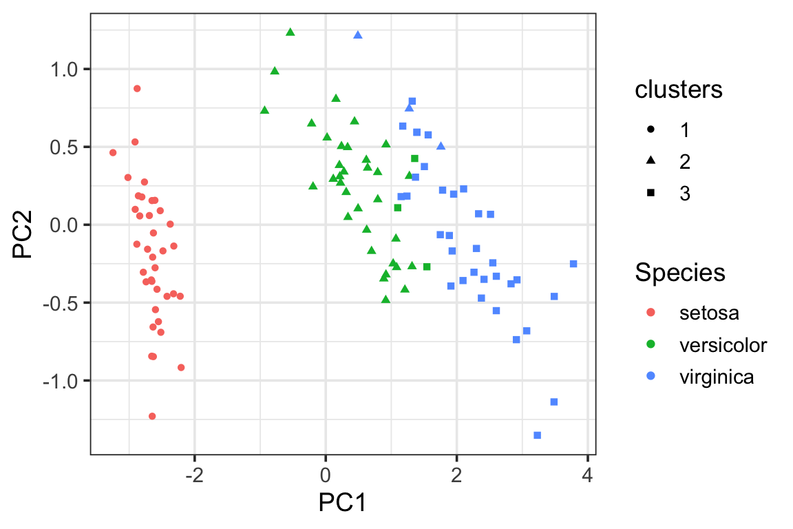
PS. If you want to learn more about clustering, heatmap and PCA, my book have full chapters devoted to those topics. Grab a copy to become a data master at here!