Seurat is great for scRNAseq analysis and it provides many easy-to-use ggplot2 wrappers for visualization. However, this brings the cost of flexibility. For example, In FeaturePlot, one can specify multiple genes and also split.by to further split to multiple the conditions in the meta.data. If split.by is not NULL, the ncol is ignored so you can not arrange the grid.
This is best to understand with an example.
library(dplyr)
library(Seurat)
library(patchwork)
library(ggplot2)
# Load the PBMC dataset
pbmc.data <- Read10X(data.dir = "~/blog_data/filtered_gene_bc_matrices/hg19/")
# Initialize the Seurat object with the raw (non-normalized data).
pbmc <- CreateSeuratObject(counts = pbmc.data, project = "pbmc3k", min.cells = 3, min.features = 200)## Warning: Feature names cannot have underscores ('_'), replacing with dashes
## ('-')pbmc <- pbmc %>%
NormalizeData() %>%
FindVariableFeatures() %>%
ScaleData() %>%
RunPCA() %>%
RunUMAP(dims = 1:10)## Warning: The default method for RunUMAP has changed from calling Python UMAP via reticulate to the R-native UWOT using the cosine metric
## To use Python UMAP via reticulate, set umap.method to 'umap-learn' and metric to 'correlation'
## This message will be shown once per sessionadd some dummy metadata
let’s pretend that the cells are from 5 different samples.
sample_names<- sample(paste0("sample", 1:5), size = ncol(pbmc), replace =TRUE)
pbmc$samples<- factor(sample_names)
pbmc@meta.data %>% head()
## orig.ident nCount_RNA nFeature_RNA samples
## AAACATACAACCAC pbmc3k 2419 779 sample5
## AAACATTGAGCTAC pbmc3k 4903 1352 sample4
## AAACATTGATCAGC pbmc3k 3147 1129 sample4
## AAACCGTGCTTCCG pbmc3k 2639 960 sample5
## AAACCGTGTATGCG pbmc3k 980 521 sample2
## AAACGCACTGGTAC pbmc3k 2163 781 sample1table(pbmc@meta.data$samples)##
## sample1 sample2 sample3 sample4 sample5
## 545 553 506 544 552FeaturePlot(pbmc, features = "MS4A1", split.by = "samples")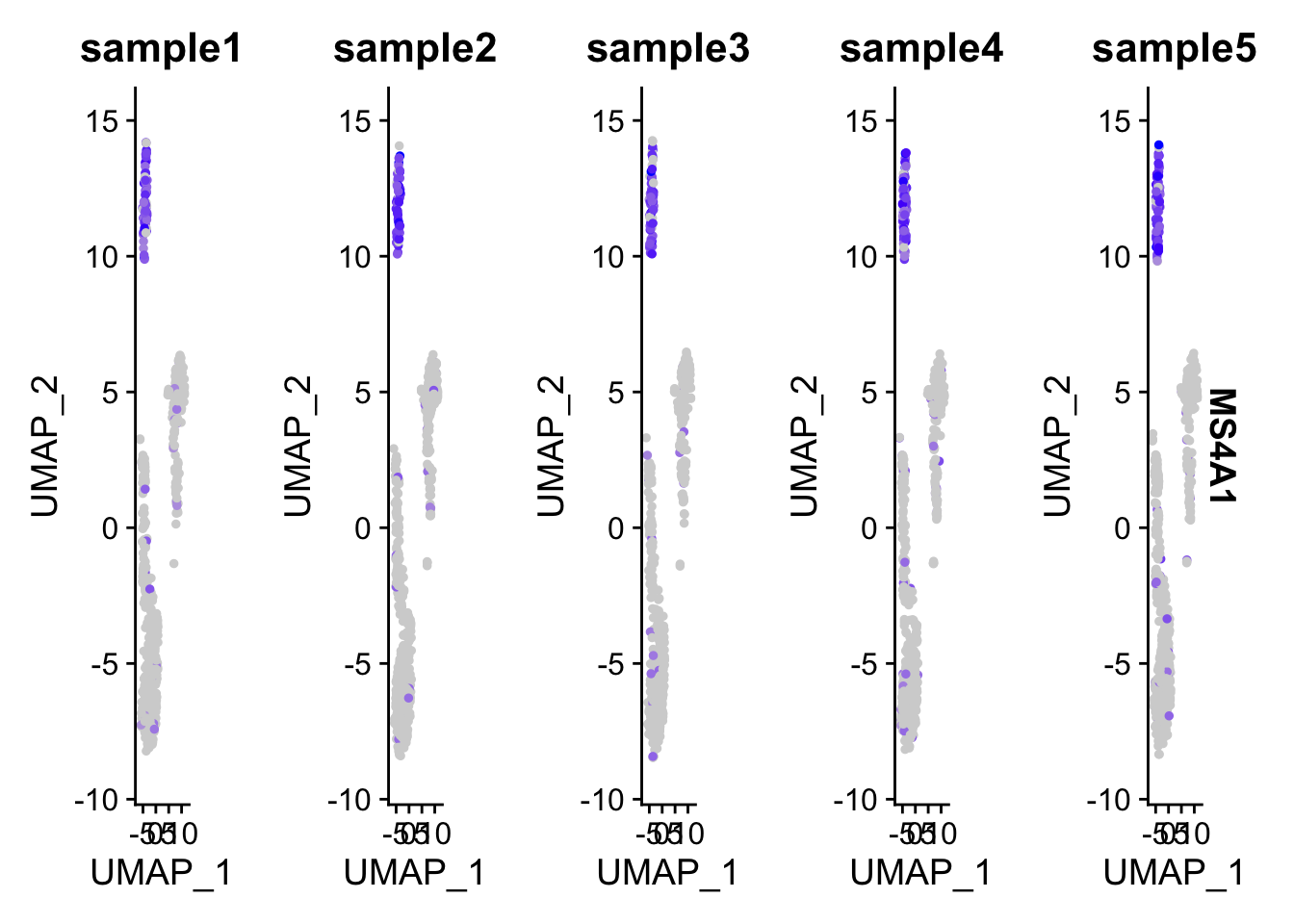
You will have 5 UMAP showing in the same row and can not arrange to multiple rows.
I do not want to re-implement the FeaturePlot function but rather rearrange the ggplot2 output by patchwork.
I wrote the following function for this purpose.
Note, only a single gene can be specified. The idea is to generate a single UMAP plot for each sample and save them into a list and then arrange them by patchwork. Also make sure the metadata_column is a factor.
FeaturePlotSingle<- function(obj, feature, metadata_column, ...){
  all_cells<- colnames(obj)
  groups<- levels(obj@meta.data[, metadata_column])

  # the minimal and maximal of the value to make the legend scale the same.
  minimal<- min(obj[['RNA']]@data[feature, ])
  maximal<- max(obj[['RNA']]@data[feature, ])
  ps<- list()
  for (group in groups) {
    subset_indx<- obj@meta.data[, metadata_column] == group
    subset_cells<- all_cells[subset_indx]
    p<- FeaturePlot(obj, features = feature, cells= subset_cells, ...) +
      scale_color_viridis_c(limits=c(minimal, maximal), direction = 1) +
      ggtitle(group) +
      theme(plot.title = element_text(size = 10, face = "bold"))
    ps[[group]]<- p
  }


  return(ps)
}
Let’s test the function
p_list<- FeaturePlotSingle(pbmc, feature= "MS4A1", metadata_column = "samples", pt.size = 0.05, order =TRUE)## Scale for 'colour' is already present. Adding another scale for 'colour',
## which will replace the existing scale.
## Scale for 'colour' is already present. Adding another scale for 'colour',
## which will replace the existing scale.
## Scale for 'colour' is already present. Adding another scale for 'colour',
## which will replace the existing scale.
## Scale for 'colour' is already present. Adding another scale for 'colour',
## which will replace the existing scale.
## Scale for 'colour' is already present. Adding another scale for 'colour',
## which will replace the existing scale.layout1<-"
ABC
#DE
"
wrap_plots(p_list ,guides = 'collect', design = layout1)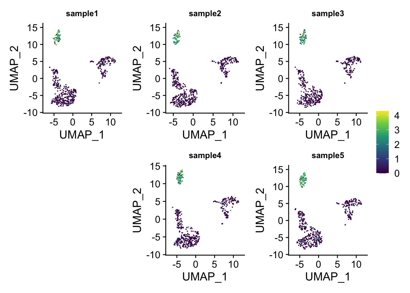
You can do even better by moving the legend to the empty space!
## insert the legend space holder to the fourth
p_list2<- append(p_list, list(legend = guide_area()), 3)


layout2<-"
ABC
DEF
"
wrap_plots(p_list2, guides = 'collect', design = layout2)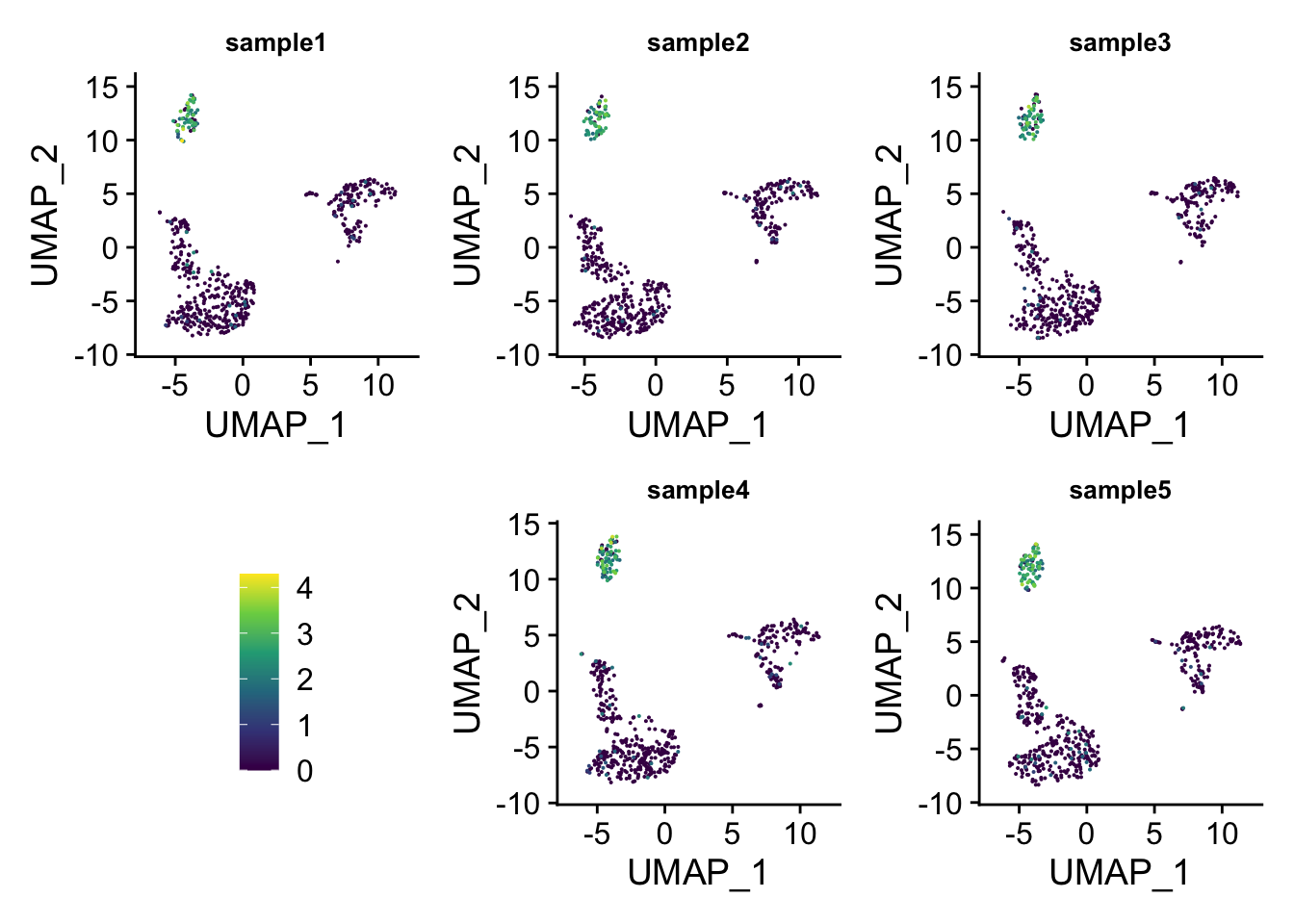
patchwork is amazing and really flexible!