I used to use cowplot to align multiple ggplot2 plots but when the x-axis are of different ranges, some extra work is needed to align the axis as well.
The other day I was reading a blog post by GuangChuang Yu and he exactly tackled this problem. His packages such as ChIPseeker, ClusterProfiler, ggtree are quite popular among the users.
Some dummy example from his post:
library(dplyr)
library(ggplot2)
library(ggstance)
library(cowplot)
# devtools::install_github("YuLab-SMU/treeio")
# devtools::install_github("YuLab-SMU/ggtree")
library(tidytree)
library(ggtree)

no_legend=theme(legend.position='none')

d <- group_by(mtcars, cyl) %>% summarize(mean=mean(disp), sd=sd(disp))
d2 <- dplyr::filter(mtcars, cyl != 8) %>% rename(var = cyl)

p1 <- ggplot(d, aes(x=cyl, y=mean)) +
    geom_col(aes(fill=factor(cyl)), width=1) +
    no_legend
p2 <- ggplot(d2, aes(var, disp)) +
    geom_jitter(aes(color=factor(var)), width=.5) +
    no_legend

p3 <- ggplot(filter(d, cyl != 4), aes(mean, cyl)) +
    geom_colh(aes(fill=factor(cyl)), width=.6) +
    coord_flip() + no_legend

pp <- list(p1, p2, p3)
plot_grid(plotlist=pp, ncol=1, align='v')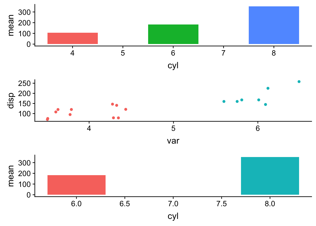
specifying aling='v' aligns the plots vertically, but because the axis limits are different the x-axis is not aligned.
Let’s use coord_cartesian to expand the xlim without filtering out the data.
p11<- p1 + coord_cartesian(xlim = c(3,11))
p22<- p2 + coord_cartesian(xlim = c(3,11))
p33<- p3 <- ggplot(filter(d, cyl != 4), aes(cyl, mean)) +
    geom_col(aes(fill=factor(cyl)), width=.6) +
  coord_cartesian(xlim = c(3,11)) +no_legend

pp1 <- list(p11, p22, p33)
plot_grid(plotlist=pp1, ncol=1, align='v')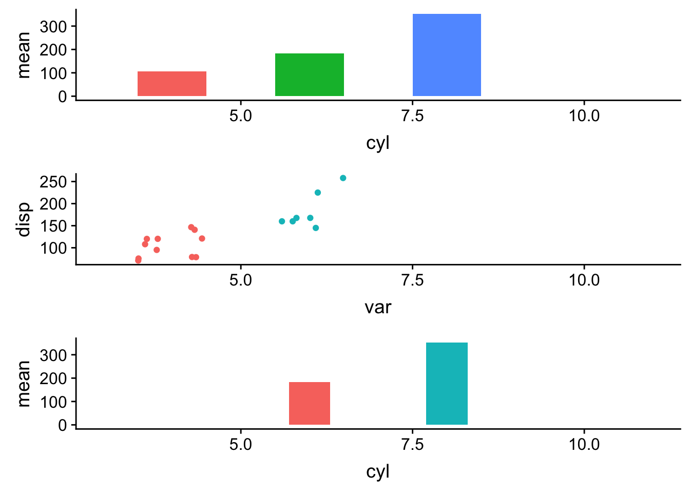
This works.
However, as mentioned in the blog post by GuangChuang Yu. There are several other cases that this may not be easy to work out:
- what if the x-axis is character string rather than continuous digits?
- what if the first plot is not from a dataframe (e.g. a tree object from ggtree)
Let’s use the other example from the blog post.
set.seed(2019-10-31)
tr <- rtree(10)

d1 <- data.frame(
    # only some labels match
    label = c(tr$tip.label[sample(5, 5)], "A"),
    value = sample(1:6, 6))

d2 <- data.frame(
    label = rep(tr$tip.label, 5),
    category = rep(LETTERS[1:5], each=10),
    value = rnorm(50, 0, 3))

g <- ggtree(tr) + geom_tiplab(align=TRUE)
g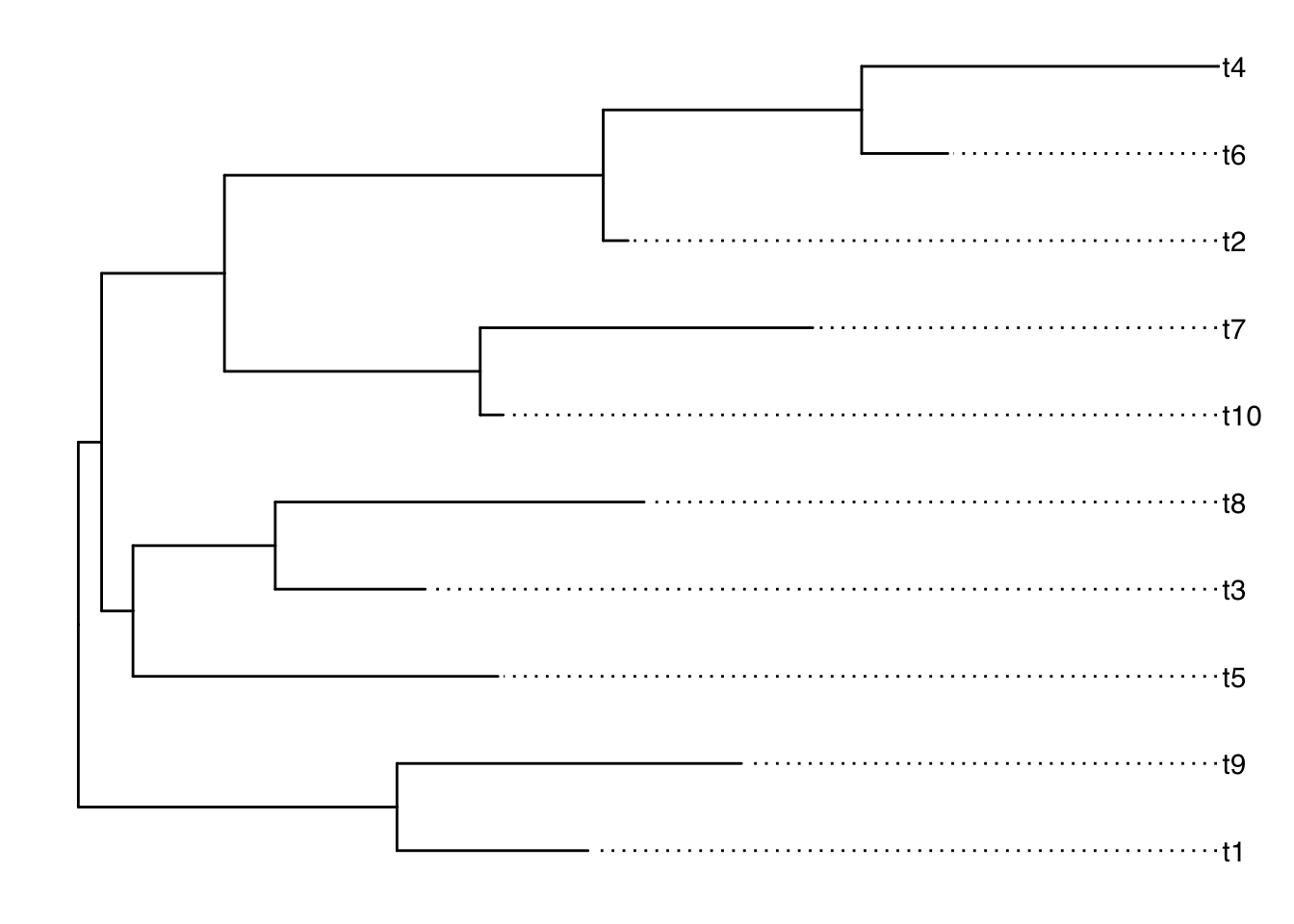
This is a tree.
Make some other dummy dataframe for making a bar plot and a heatmap:
d <- filter(g, isTip) %>% select(c(label, y))

dd1 <- left_join(d1, d, by='label')
dd1
## label value y
## 1 t4 5 10
## 2 t6 6 9
## 3 t9 2 2
## 4 t2 3 8
## 5 t1 4 1
## 6 A 1 NAdd2 <- left_join(d2, d, by='label')
head(dd2)## label category value y
## 1 t1 A -3.3159014 1
## 2 t9 A 1.1526652 2
## 3 t2 A 0.9969863 8
## 4 t6 A 3.7986173 9
## 5 t4 A 4.9893312 10
## 6 t10 A -2.1545959 6# a bar graph
p1 <- ggplot(dd1, aes(y, value)) + geom_col(aes(fill=label)) +
coord_flip() + theme_tree2() + theme(legend.position='none')
# a heatmap
p2 <- ggplot(dd2, aes(x=category, y=y)) +
geom_tile(aes(fill=value)) + scale_fill_viridis_c() +
theme_tree2() + theme(legend.position='none')
cowplot::plot_grid(g, p1, p2, ncol=3, align='h',
labels=LETTERS[1:3], rel_widths = c(1, .5, .8))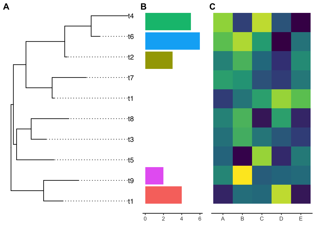
The y-axis is not aligned with the tip of the ggtree output if you read carefully.
Let’s use the ylim2 function from ggtree:
p1 <- p1 + ylim2(g)## the plot was flipped and the y limits will be applied to x-axisp2 <- p2 + ylim2(g)
cowplot::plot_grid(g, p1, p2, ncol=3, align='h',
labels=LETTERS[1:3], rel_widths = c(1, .5, .8))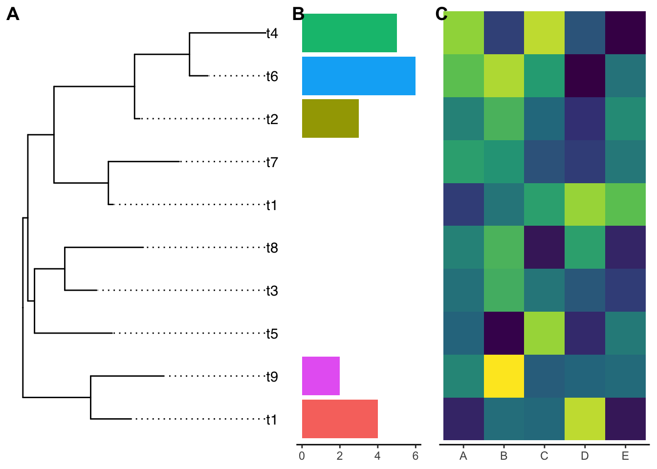
Now they are aligned perfectly!
ggtree::ylim2() and ggtree::xlim2() can be very useful for other cases. Thanks GuangChuang Yu for making it!